homeLiving roomThe right color combinations when decorating walls in living rooms
The right color combinations when decorating walls in living rooms
When choosing basic and additional color solutions in the interior, it is necessary to proceed from the size and shape of the room, the height of the ceilings, lighting, as well as personal tastes and preferences.
The choice of wall color is influenced by the area of the room, lighting, style features and personal preferences
The combination of colors in the interior of the living room of a small Khrushchev, where it performs several functions, is very important. Here they meet guests, sleep, study. A well-chosen tandem of shades will make the interior cozy, homely and original.
Basic rules for combining colors in the interior of the living room
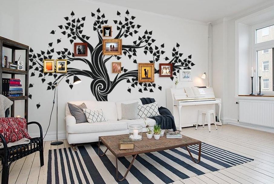
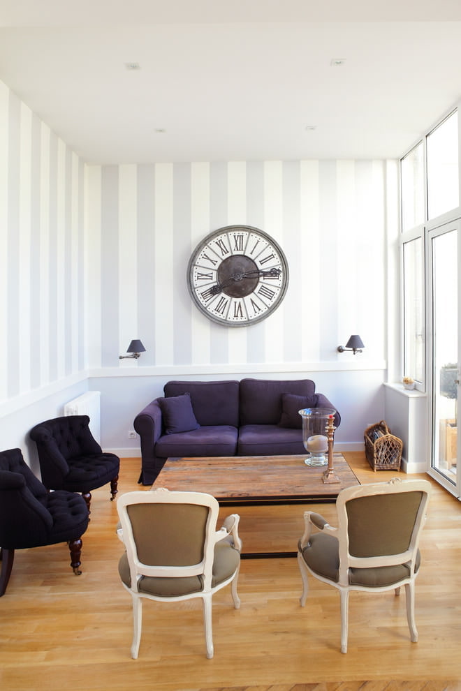
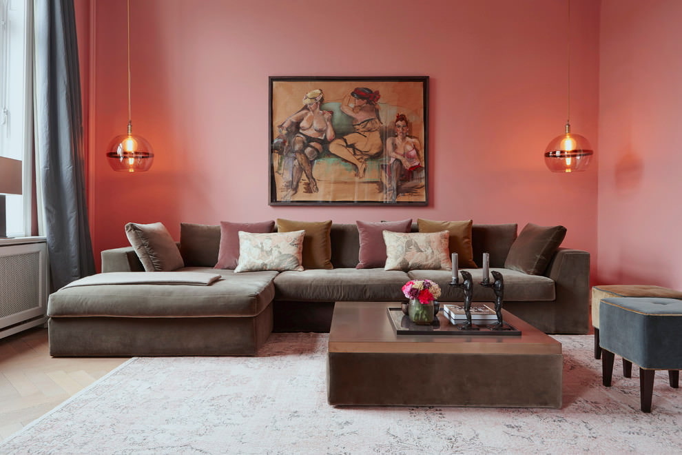
The design of the living room can be made in any style, as well as in various color combinations. Someone prefers calm pastel colors or delicate pink shades. And give someone bright, catchy colors of pop art.
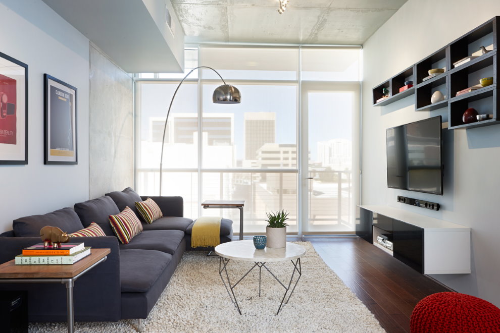
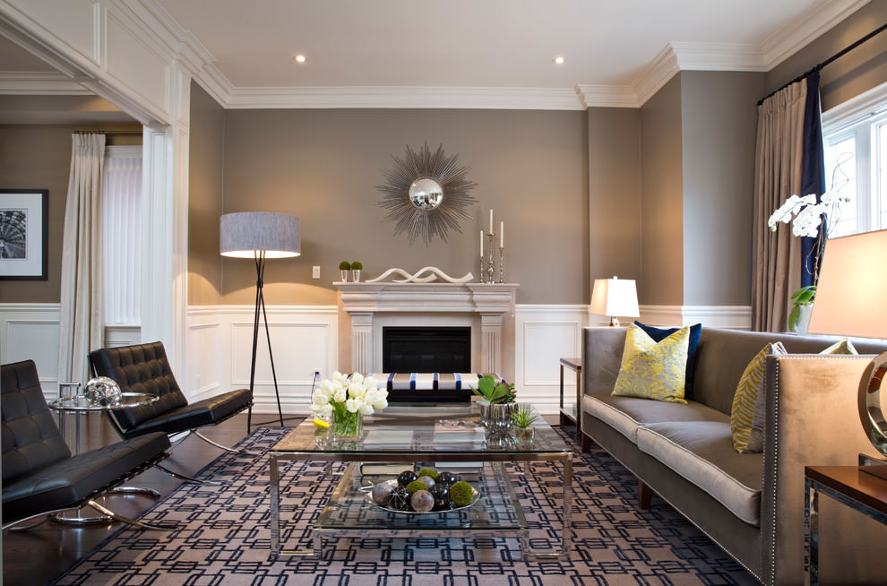
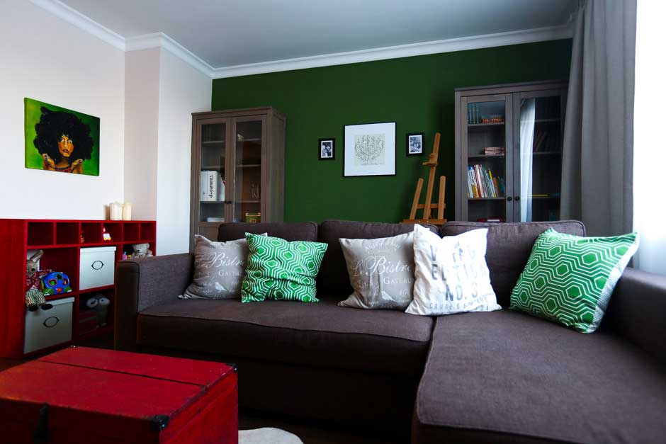
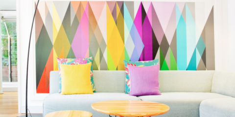
Minimalist directions mean plain walls in combination with bright interior items
When choosing a style direction, designers use certain palettes of shades inherent in a particular interior style:
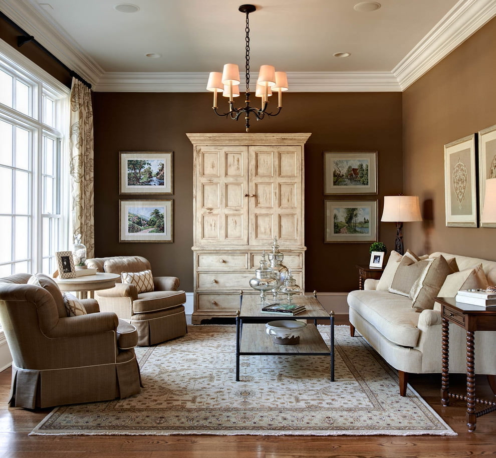
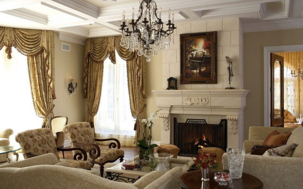
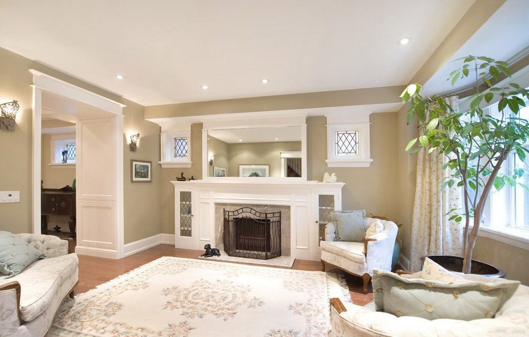
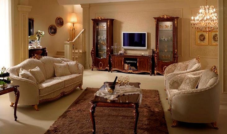
Traditional colors for the classics - beige, milky or light yellow
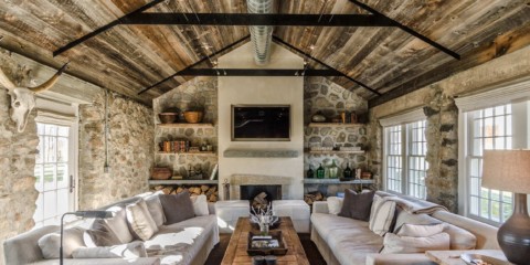
For a country style interior, natural shades of natural materials are typical - wood or stone
Provence gravitates to turquoise and lilac shades, floral patterns
Psychology in the use of colors, human impact
Psychology claims that the state of the psyche and the character of a person will be perfectly told by the colors to which he gives more preference and those that make you sad or cause fatigue and irritation. All this must be taken into account when planning the living room, and not just follow fashion.
The color of the walls can have a strong effect on the human psyche.
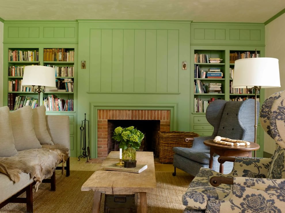
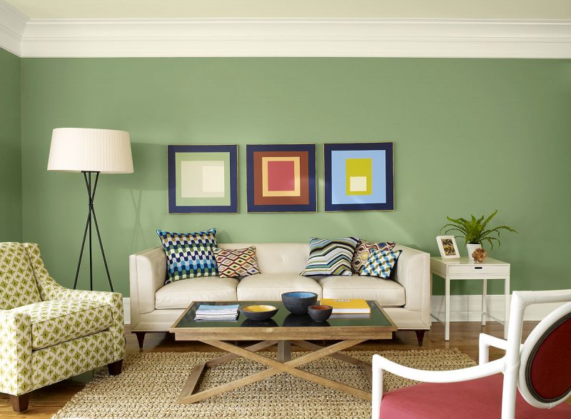
Green tones have a beneficial effect on vision and have a relaxing effect.
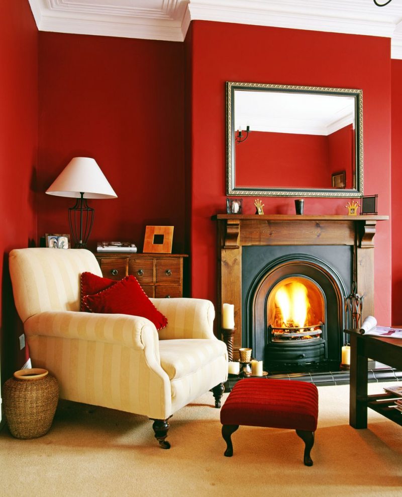
So, for example, red color is contraindicated for people suffering from mental disorders. It is chosen by leaders, passionate and passionate. He calls for action. Very carefully you need to approach when choosing the primary color in the interior, especially in small rooms.
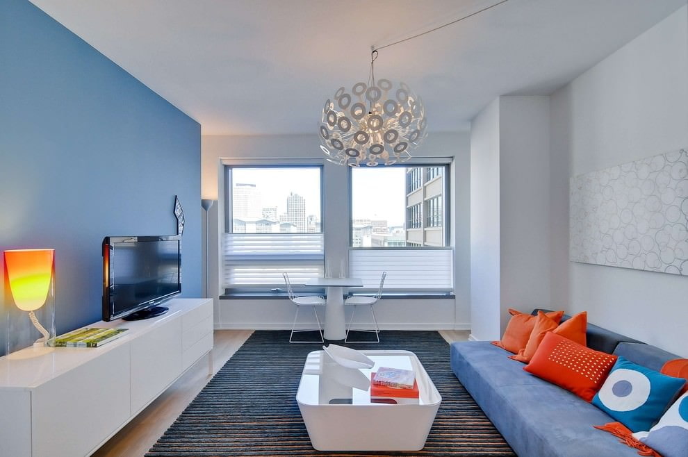
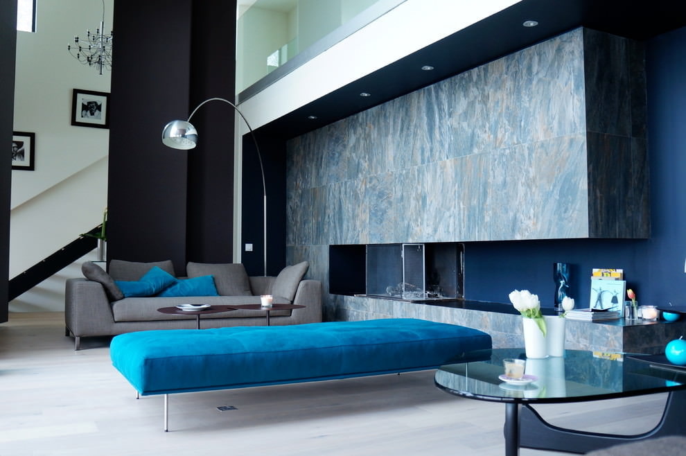
Shades of blue in the living room will help to concentrate, as well as allow you to relax and calm down.
Blue and turquoise will bring lightness, carelessness and mischief to the interior.
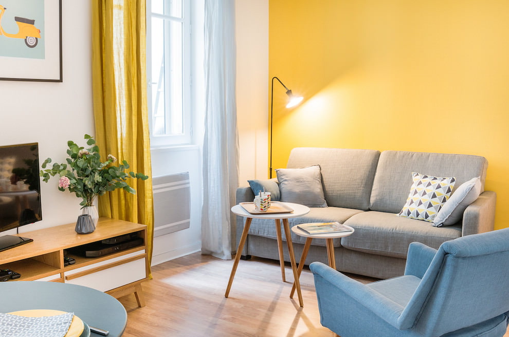
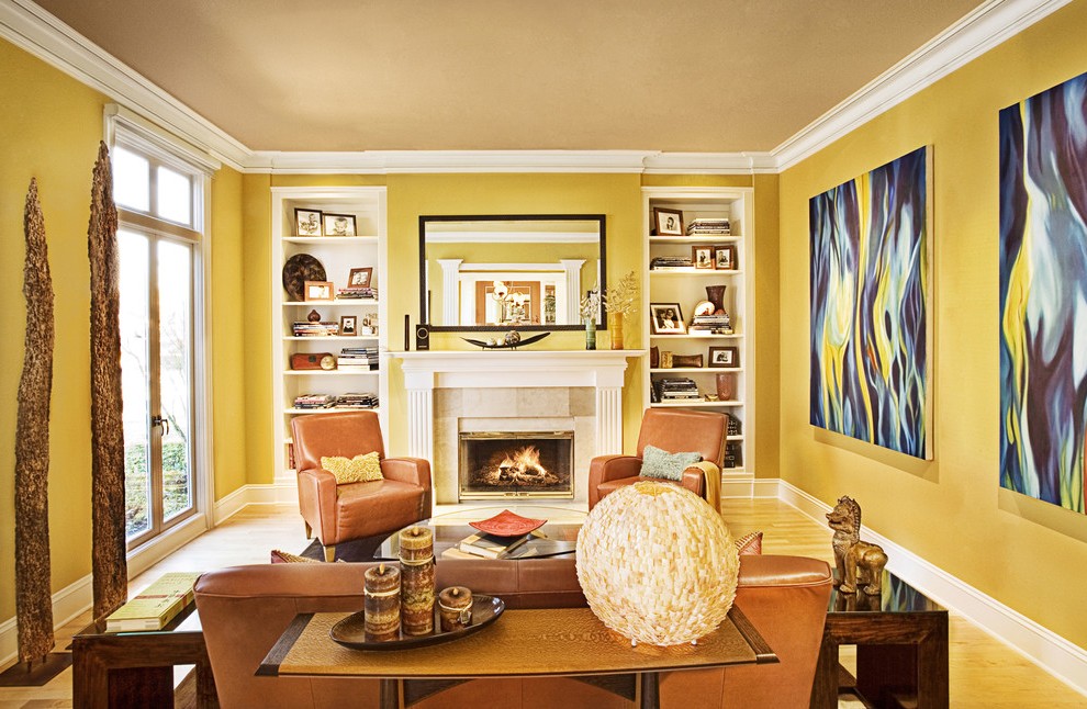
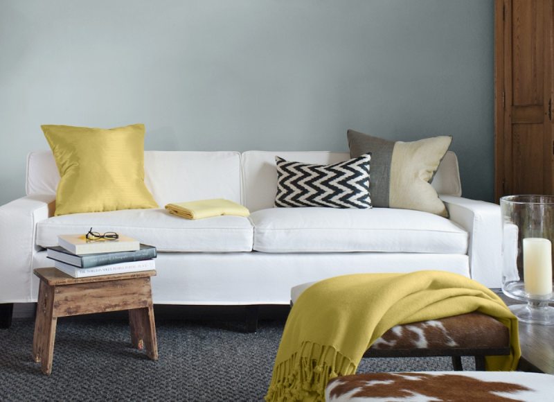
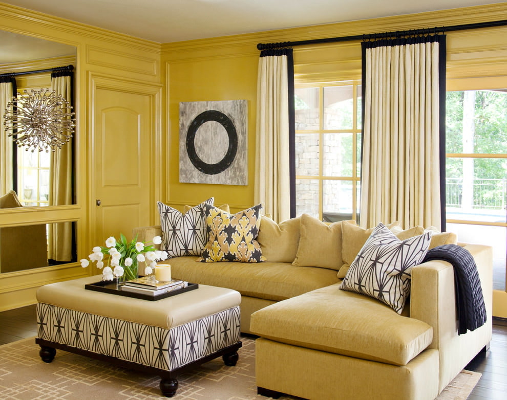
Sunny yellow indicates an energetic, cheerful person.
Green - anti-stress, creates a relaxing atmosphere.
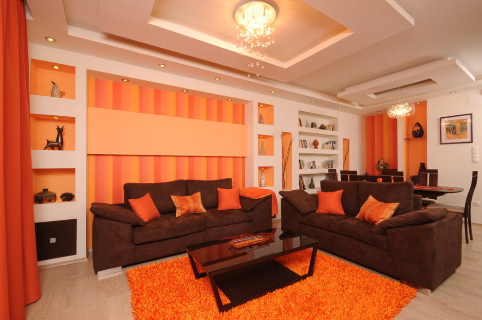
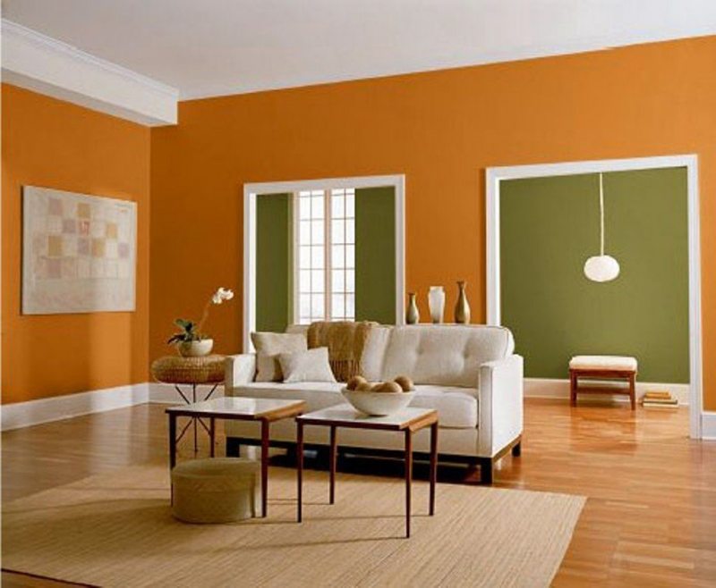
Orange is an indomitable fountain of energy.
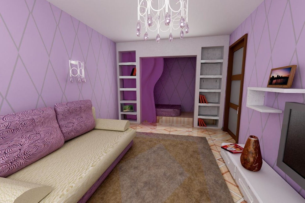
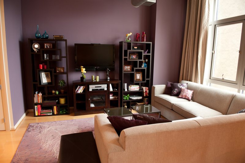
Violet is the color of mysticism and creative energy.
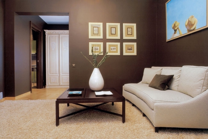
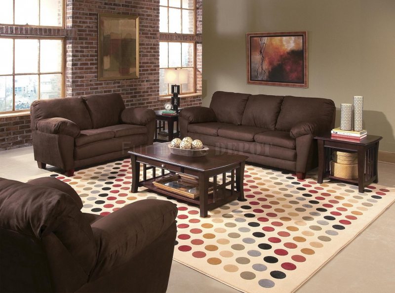
Brown is the choice of versatile personalities. Creates a sense of privilege and chic.
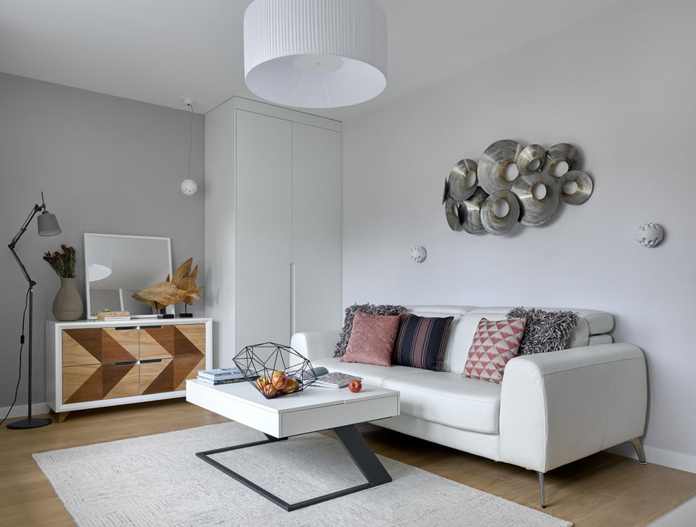
Gray - neutral, takes on the aggressiveness of bright colors. As an independent color, it’s quite sad. He is preferred by individuals who strive for constancy and mutual understanding.
Colors can soothe, invigorate, stimulate action. A person throughout his life reaches for his beloved flowers, from which he draws energy, vitality and inspiration. That is why the choice of the color scheme of the living room is so important - a room in which they spend a lot of time. The calmness and comfortable finding of a person in a living room depends on the correctness of the decision.
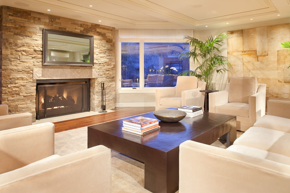
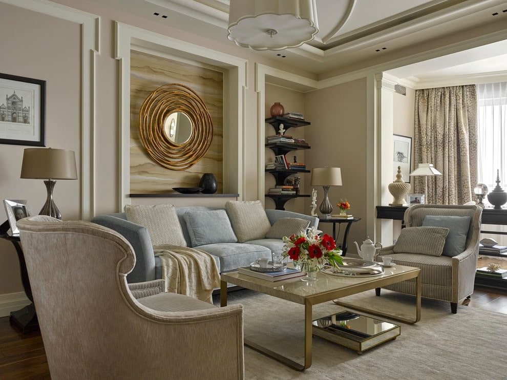
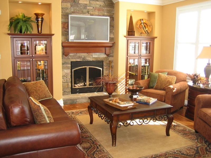
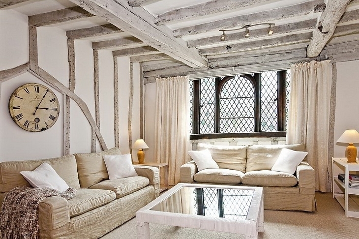
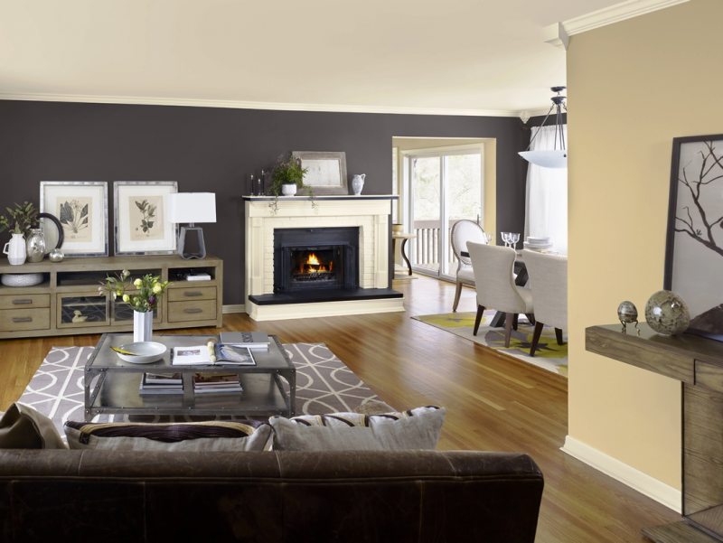
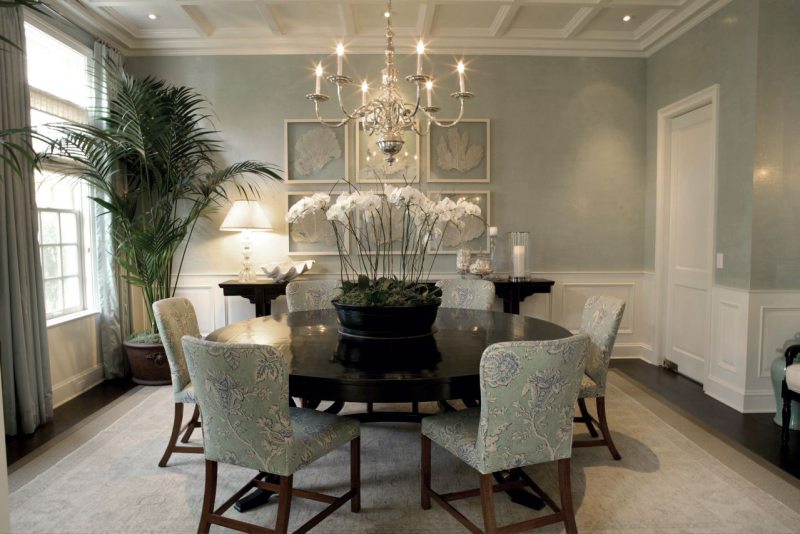
A living room with beige walls that harmoniously look in any style direction always comes out warm and cozy.
Warm and cold colors in the interior of the living room
Coloring is a whole science of color design of premises.
The main criteria for selecting the color of a living room:
The foundation for further decoration of the room is a correctly selected base.
All colors are divided into two groups: cold and warm colors.
Warm colors bring comfort to large rooms.
Cold tones help visually increase the space of a small room.
The choice of style is the main determining one when choosing the main and auxiliary tones.
When deciding which color scheme to choose for the living room with the whole family, it is necessary to give preference to the majority.
Color can affect the overall picture of the interior both positively and negatively.
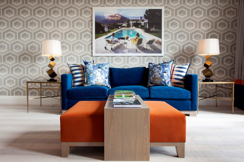
Quite often, neutral colors are chosen as the basis for decorating the living room. To make notes of a cheerful mood in such an interior, rich tones will come to the rescue as an addition or accents. They can be both warm and cold. How to combine them depends on the preferences of the owners.
Each of the three primary colors - red, yellow and blue, can have warm, neutral or cold colors.
Cold shades incorporate the lion's share of blue or gray
The composition of warm tones is red or yellow.
Shade combinations
In old typical buildings, where the living room is a small room with low ceilings, it is better to choose a palette of cold colors dominating. They will help to visually expand and increase the space. For spacious apartments or houses, an excellent solution is a living room in warm colors, while cold ones can be taken as auxiliary for decorating textiles or accessories.
The color scheme of the walls allows you to visually adjust the dimensions of the living room
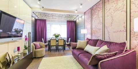
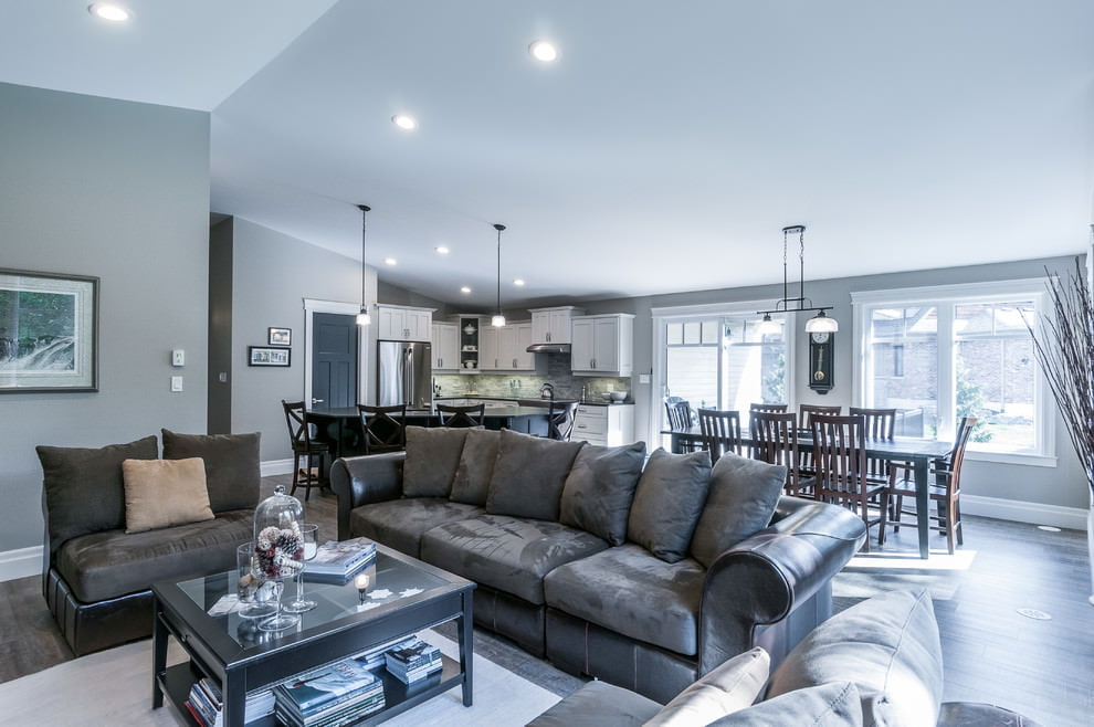
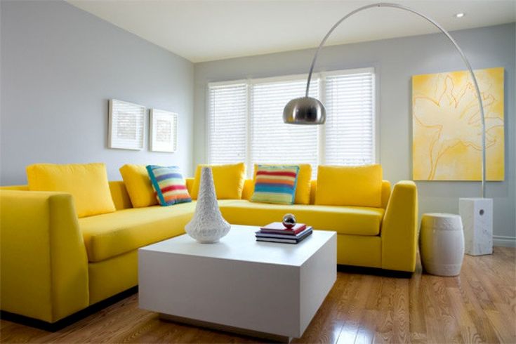
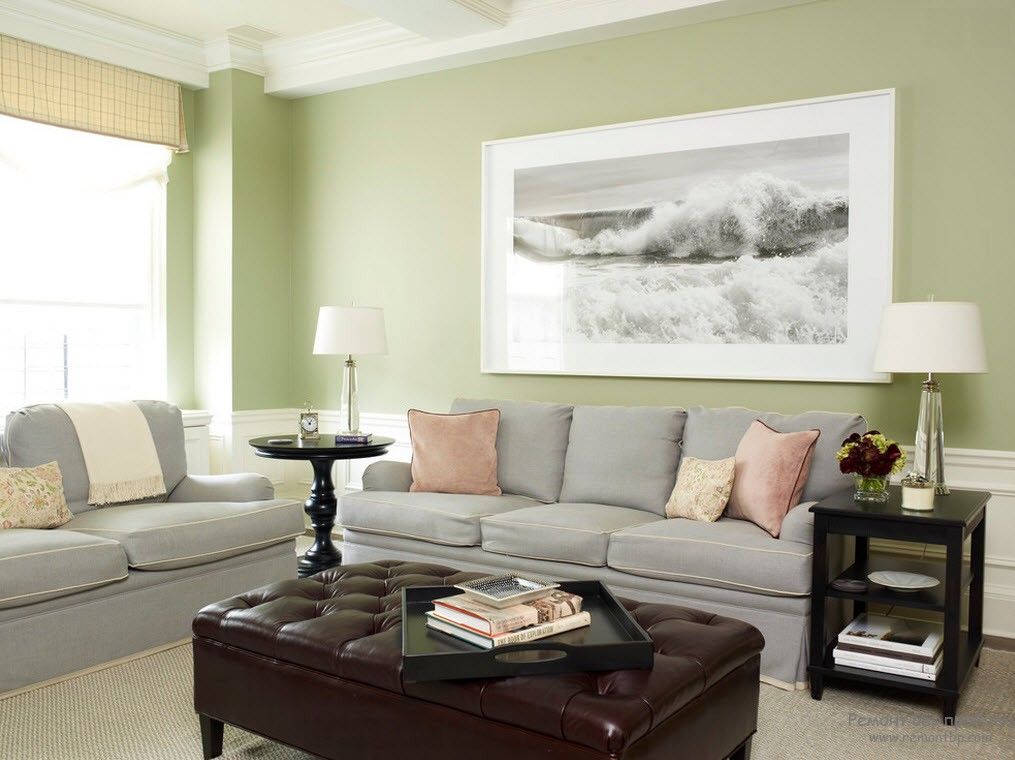
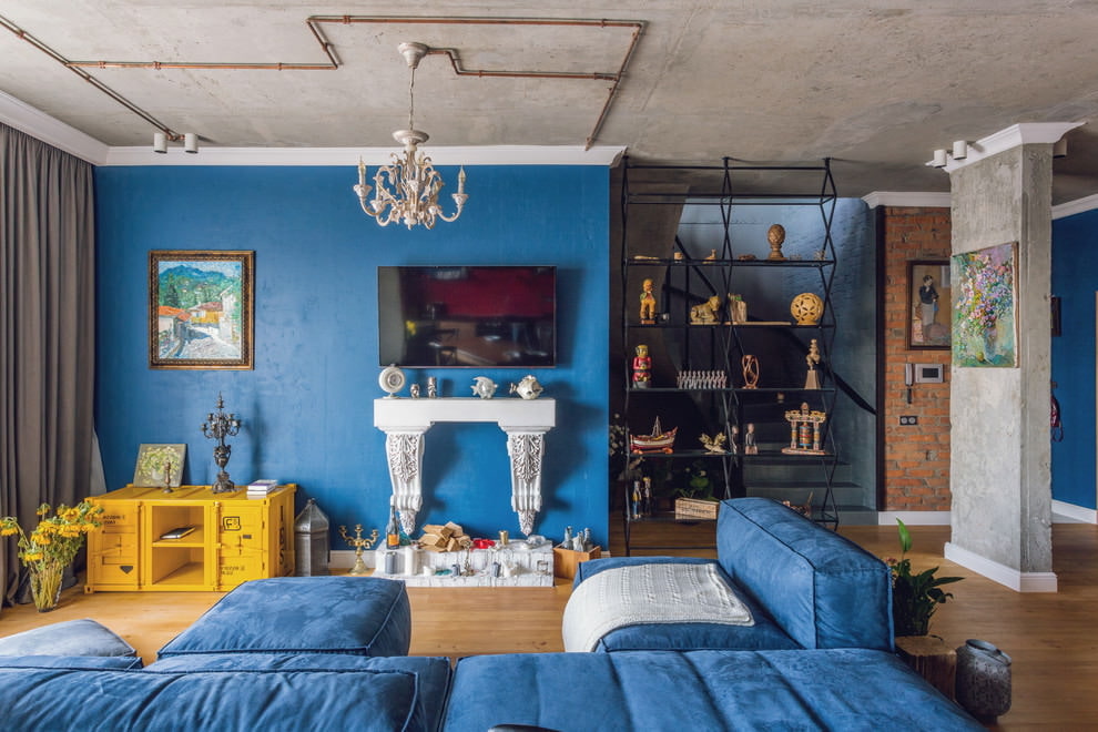
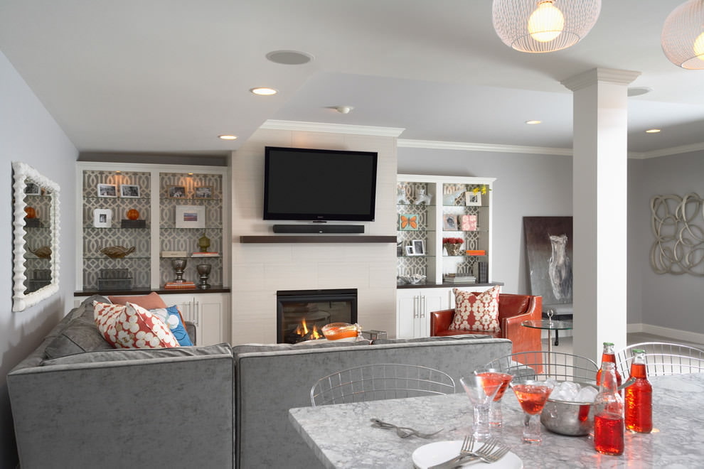
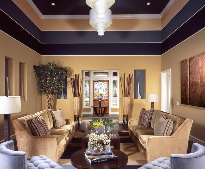
An excellent non-trivial combination of colors in the living room: gray, emerald, yellow. Basic is better to choose gray, and some accents of yellow or emerald will bring notes of warmth, coziness and joy.
Yellow is subconsciously always associated with something pleasant and warm.
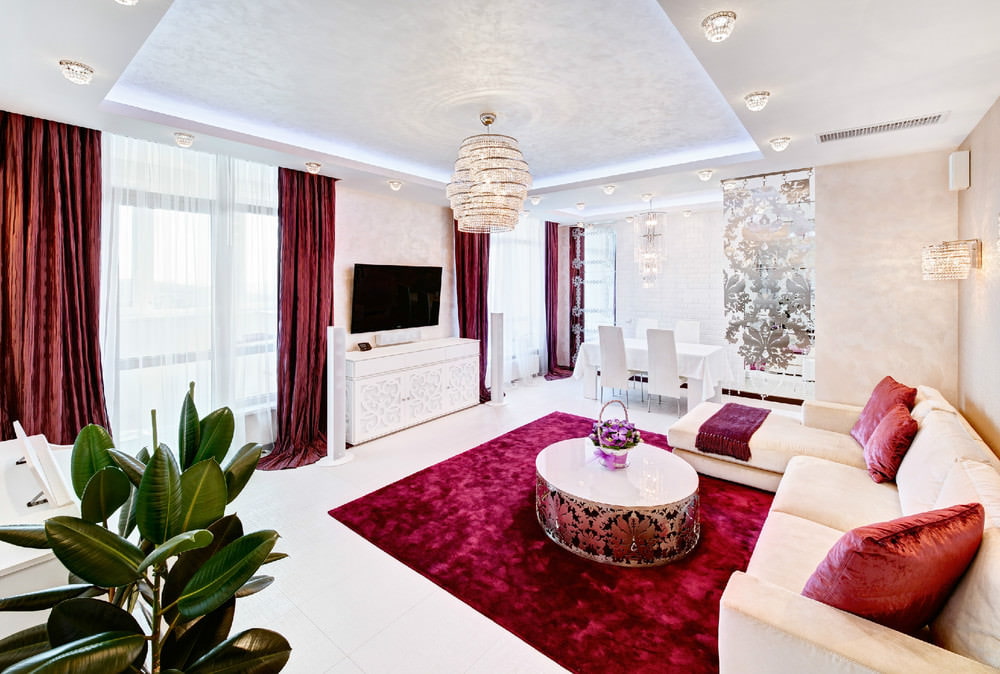
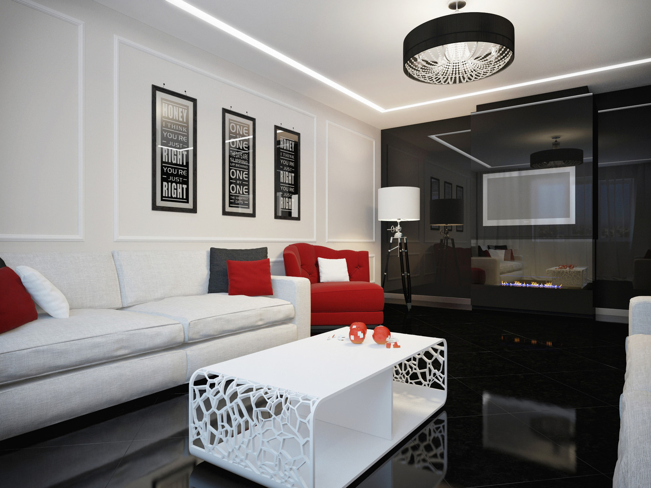
In tandem, white, brown, red - white color will damp the brightness and activity of red, which is best used in textiles. Brown goes well with wooden furniture.
White walls will become the basis for the character of the interior, and brown accents will add variety and soften the “hospital” atmosphere
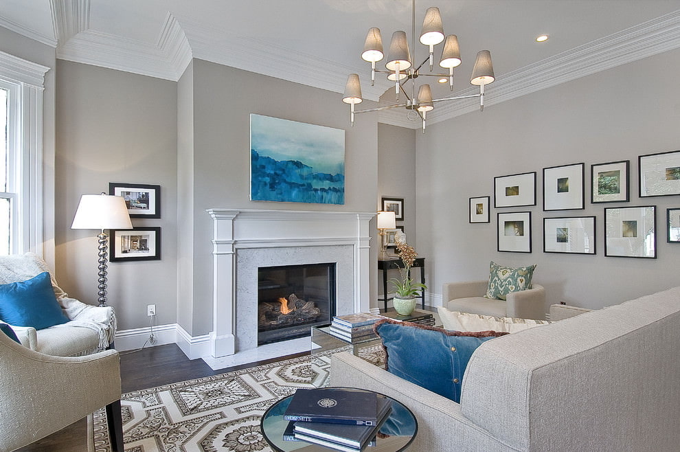
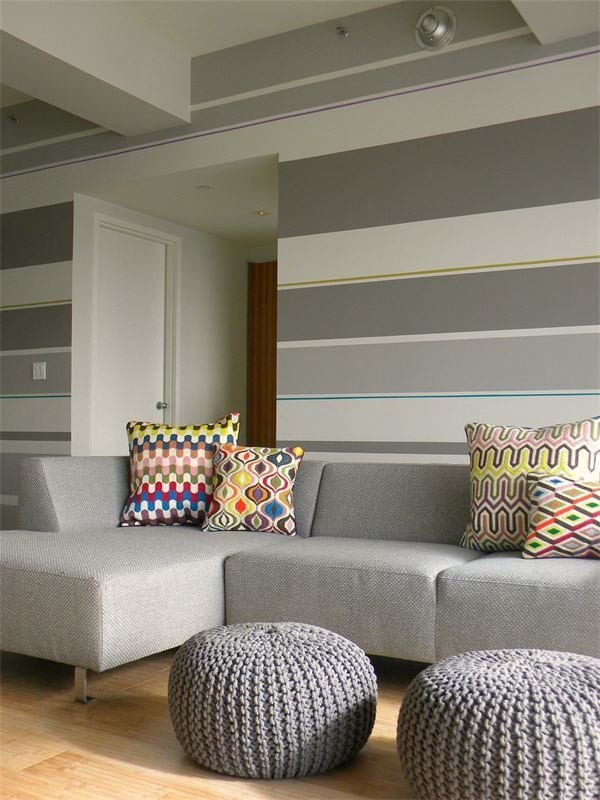
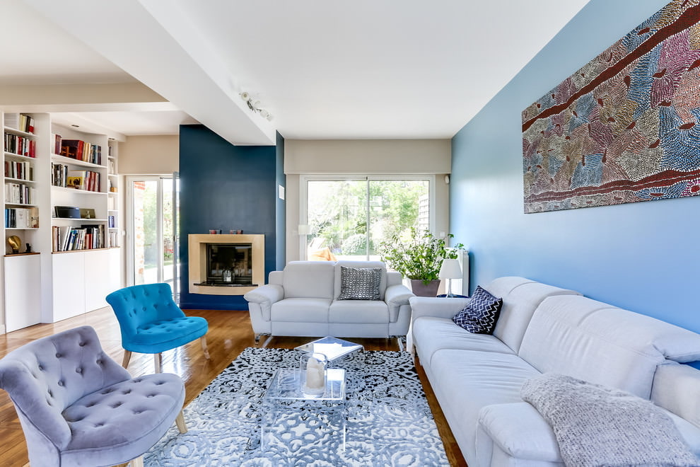
Another version of the color scheme for the living room: gray, beige, blue. The basis is gray, blue - as an additional relaxation, which in turn will emphasize and enhance gray. If you combine them with a warm beige shade, it will bring cosiness to the space.
Modern living room in gray, the effect of which is balanced by accents in blue tones
Coloring a living room with color
The use of colorization methods in the interior of the living room will help to correctly design the zoning of the room. This issue is especially relevant in small apartments, where every square meter is important.
Having designed each area of the living room in a certain color scheme, you can visually divide the space without creating physical obstacles
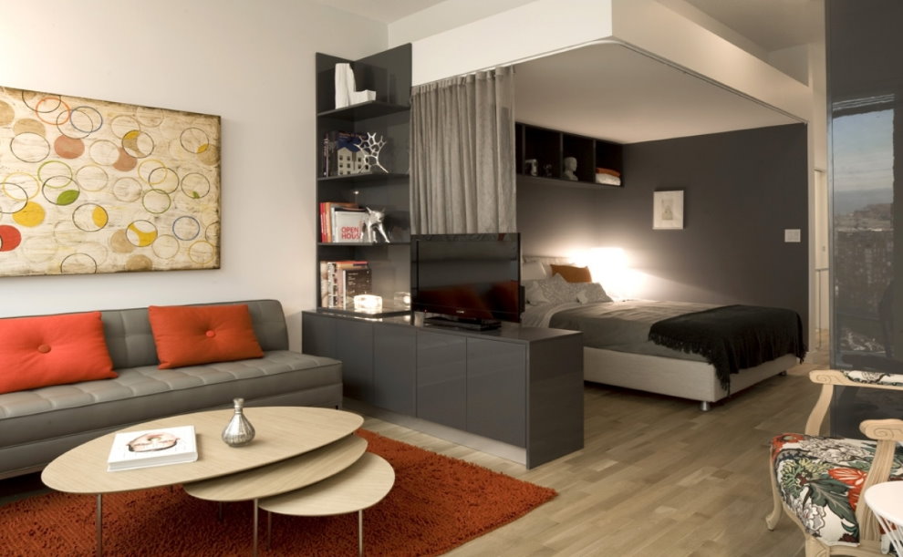
For example, a living room combined with a bedroom.To design such a room, it is better to use contrasting colors, playing shades of light and dark tones. The corner zone in which the usual sofa is located in the daytime playing the role of upholstered furniture, and at night - the function of a sleeping bed, can be decorated in delicate beige shades. Contrast to highlight the area with armchairs and a coffee table, choosing a brighter coffee tone for it. Shelves or screens can help divide zones.
The sleeping area in this living room is highlighted in dark shades.
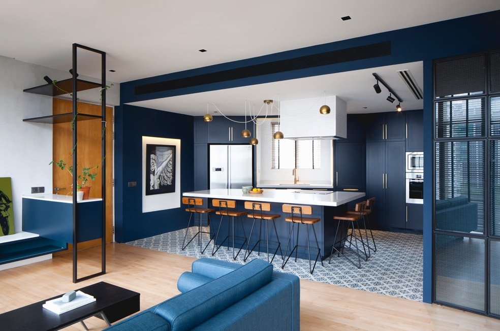
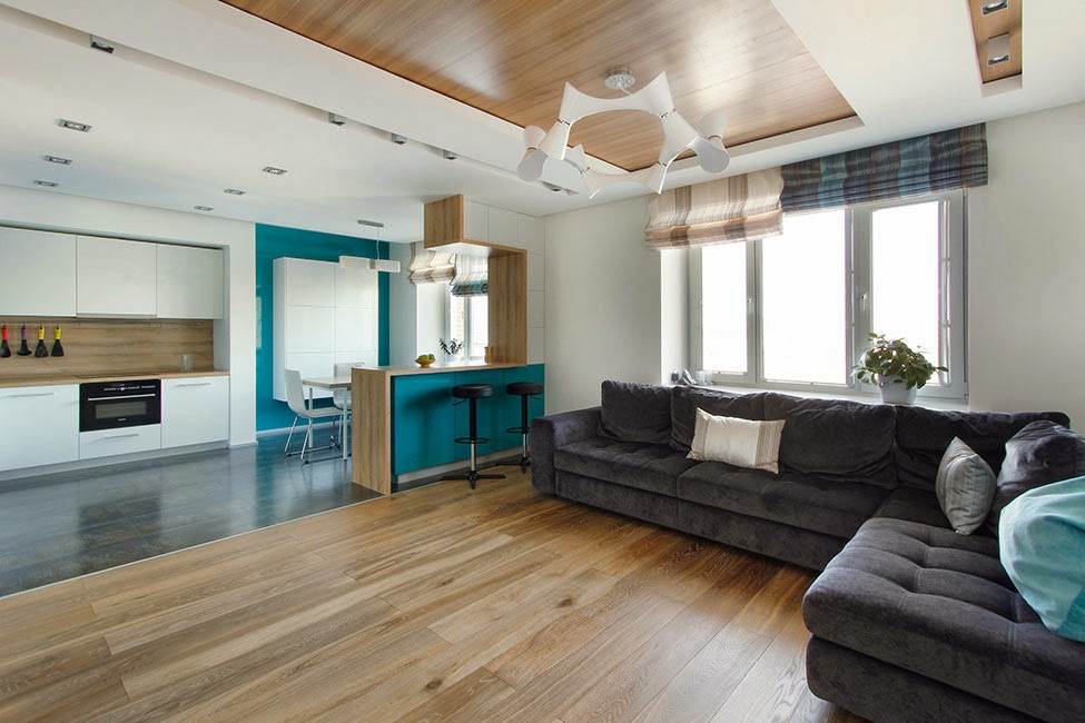
No less interesting is the option of zoning the living room combined with the kitchen. The selection of finishing materials of various colors and structures will help to highlight several important areas in the room. Part of the kitchen is decorated with artificial or natural stone, or brick. In this case, the recreation area is best done in calm, gentle colors using painting, wallpaper or plaster. The bar-bar made of natural wood with high chairs will help to divide the zones. In the same version, the rack can be replaced with a real fireplace, if it is a private house, or an electric one is quite suitable - now they are a huge choice for every color and taste.
An example of zoning a kitchen-living room with contrasting wall decoration
The choice of color, taking into account the cardinal points in the room
A very important role in the choice of colors in the interior of the room is lighting - both artificial and natural. Please note that when projecting light onto the surface of a painted object, the color takes on different shades. It is extremely important to take into account which side of the world the room is located: north, south, west, east.
Warm shades of beige, yellow or light brown are better suited for the north side.
In a room with windows to the south, you can use cold shades of gray, turquoise or sky blue
In the south and south-west, the sun shines through the windows almost all day. Here, for the interior of the living room, it is better to use cold shades of green or blue. In the northern sun is absent, gloomy natural lighting must be diluted with bright and warm colors. Yellow, orange, olive are perfect.
Peach, pale pink or honey tones are well suited for the living room on the east side of the house
Photo color options for walls in the living room, how to paint
Examples of the influence of natural light on the color scheme depending on the side of the world:
south direction: strengthens yellow-white and eats other colors;
northern: blue accent and dulling of other colors;
Eastern: adds a green tint;
western: introduces orange tones.
Peach color goes well with burgundy and mustard
The olive color harmoniously looks in a classic interior or in a country-style living room
When choosing paint, you must clearly understand what surface it is intended for. If the color of the walls in the living room is considered, then the sample needs to be fixed on the wall, and not on the table or on the floor, always taking into account the natural and artificial lighting of the room. It is important to remember that the same colors in different lighting conditions, both daylight and artificial, look different.
All of the above is like a kind of starting point in a vast world of light and color. Undoubtedly, the experience and knowledge of specialists will help determine the choice of suitable color solutions in the interiors of any premises. But the most important thing is not afraid to experiment, of course, in the good sense of the word. Everything that surrounds us was invented by cranks, without them the world would be boring and black and white. If the proposed option does not suit you, you need not be afraid to do it your own way.
Beautiful examples in the interior of the living room, photo
Now, there are a lot of young designers who use creative solutions for decorating living spaces in their work. Although they adhere to certain standards, their world is still a little different.It is brighter, more saturated with colors, vibrant and extraordinary.
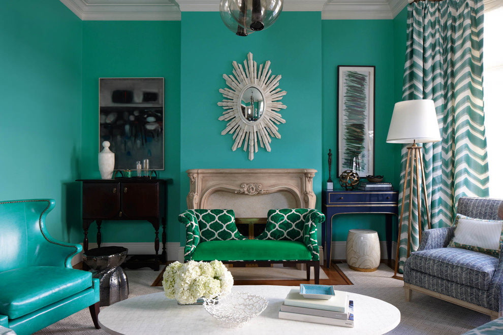
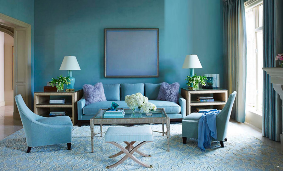
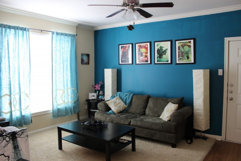
The feeling of freshness and spaciousness is given by painting the walls in turquoise color
The use of different shades of the same color gives a visual increase in the area of the living room
Living in an era of global change and the latest technology, you need not be afraid to keep up with the times. After all, every day brings something new to our life and it is wonderful!
Video: Variants of beautiful wall decoration in the living room
Photo: Examples of color combinations in the interior of the living room
Each room in the house has its own purpose. The main function of the living room is the reception of friends, relatives, relatives. It organizes holidays, holds ...
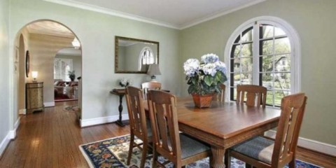
The arch between the kitchen and the living room - photos with such an element look very harmonious - a very simple and at the same time functional item of the style decision ....
The drawing room is one of those rooms in which the whole large and friendly family often gathers together after a hard working or school day. And of course...
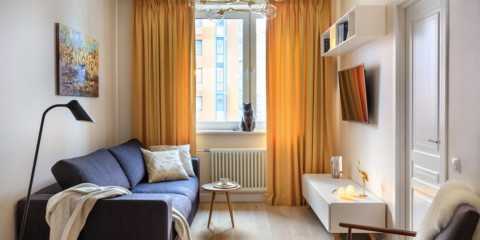
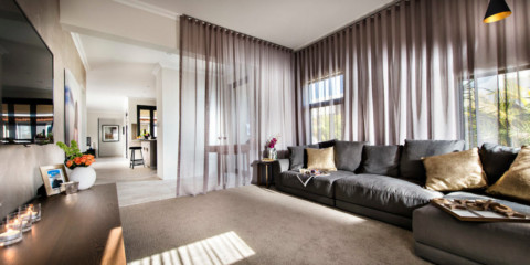
Not a single interior is complete without the design of window openings. It is the textile design that makes the room cozy and attractive. It is usually carried out ...
Each person strives to make his living room the most cozy, beautiful, functional and comfortable place in the whole house. And this desire is quite logical ...
Choosing the right design for your place of residence is a very difficult task, which must be approached with responsibility. Each style has its own ...


 Living room
Combined wallpaper in the living room - a modern solution for the interior
Living room
Combined wallpaper in the living room - a modern solution for the interior