homeLiving roomPastel color in the interior of the living room - design tips
Pastel color in the interior of the living room - design tips
The living room is one of the main rooms of our home, whether it is a city apartment or a country cottage. We invite guests here, here we relax, relax and spend evenings with our family. And of course, I want to design it in the most beautiful and neutral way so that everyone likes it. One of the successful solutions will be a living room in pastel colors. To make it lively, dynamic and at the same time relaxing, it is important to consider several points.
The interior in pastel colors looks attractive and has a beneficial effect on the psychological state of a person
The drawing room is the room where life is in full swing. It is important that the interior itself does not distract too much attention. That is, it is important to maintain harmony and a middle ground, especially in the color scheme. After all, the color scheme, including walls, curtains and furniture, is what immediately catches the visitor’s eyes and this is what the landlord feels every time he goes into the house.
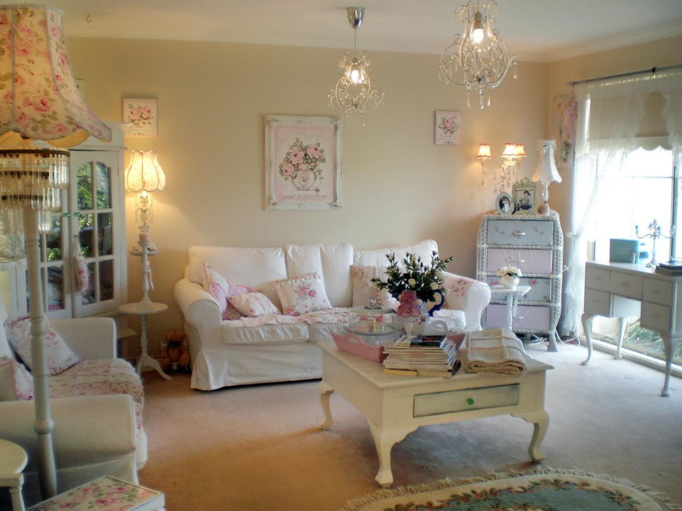
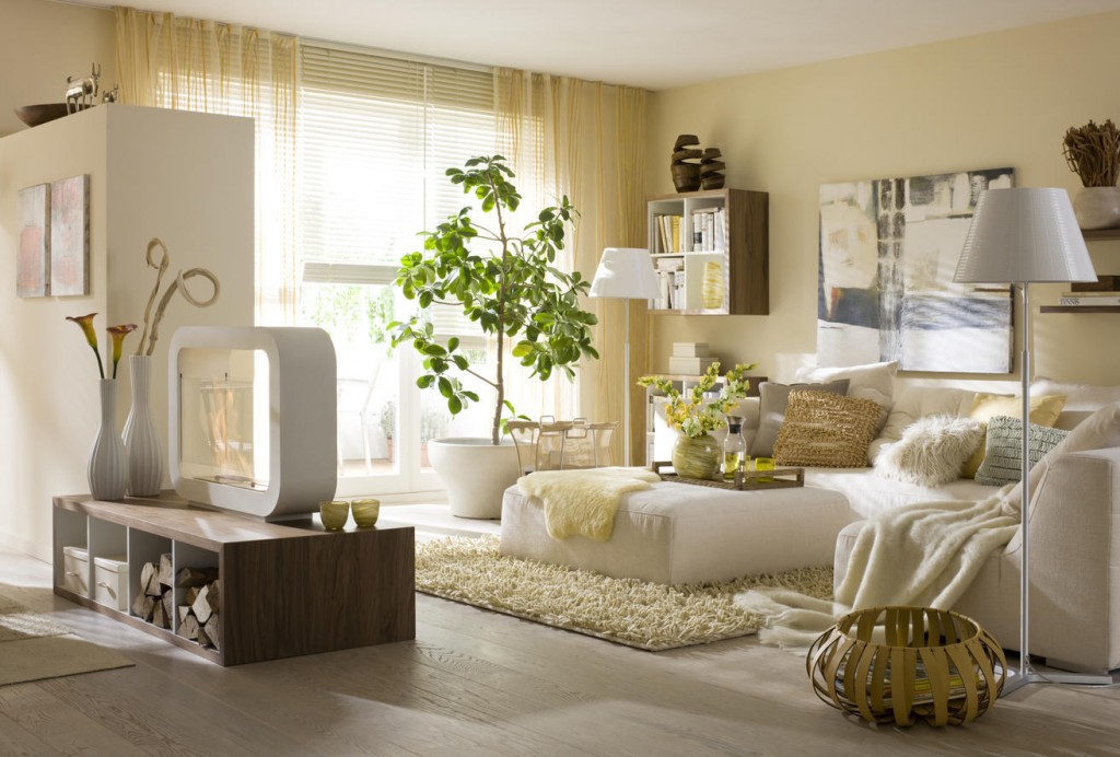
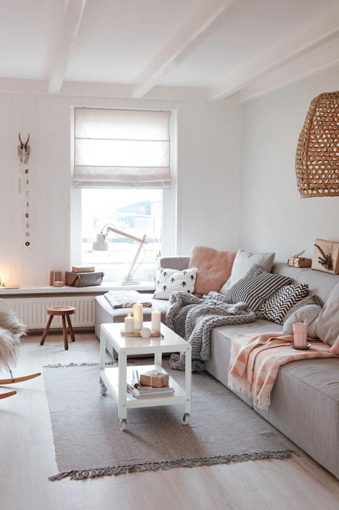
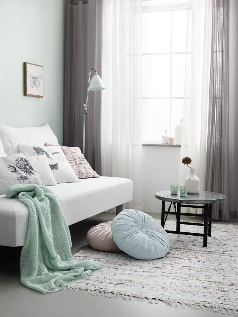
Pastel shades make the interior more warm and cozy
Basic rules for choosing colors in the interior
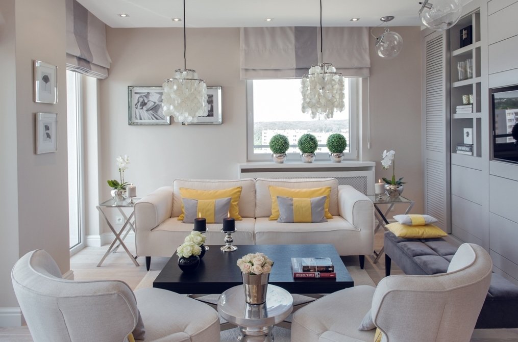
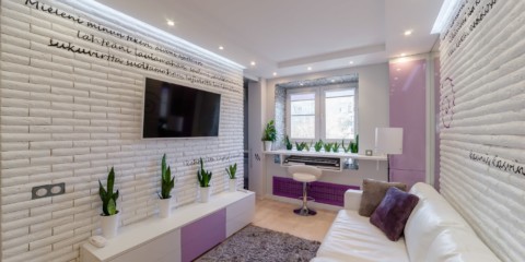
The living room is a multifunctional room and it is better to choose neutral colors here. Today is a stormy party, tomorrow you just want to relax, and after tomorrow arrange a warm, cozy evening with the whole family. That is why pastel colors are best suited for this room, as they are neutral.
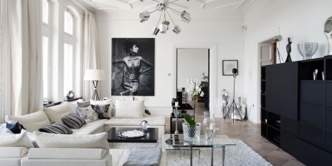
Pastel colors create a chamber atmosphere and emphasize the contrasts created by decorative elements.
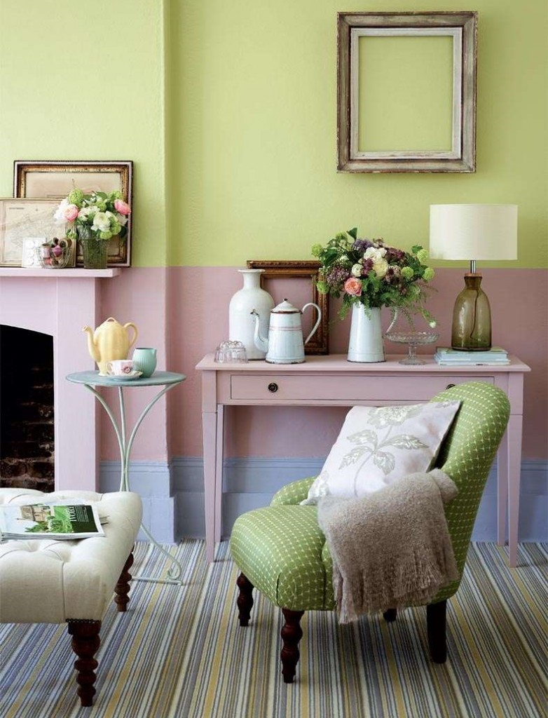
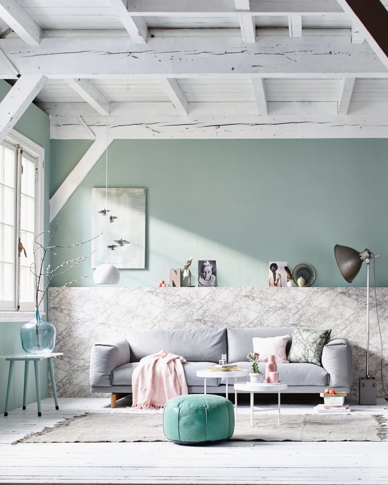
Pastel colors can be cold or warm.
For the south side, it is better to choose cold shades - blue, green, turquoise or pale pink. For the north side, more comfortable options are suitable: warm pink, lilac, yellow and beige.
Pastel shades are ideal for interior in the style of shabby chic, eco-style or country.
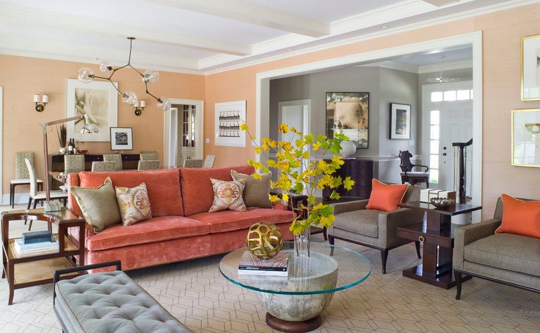
It is important to choose a color as the basis. It is suitable for decorating walls, curtains and large furniture. Smaller objects may be the same color, but darker or lighter, or may be in contrast. For the living room in pastel colors, either contrasting options or combinations of different tones look good. The first option sets the rhythm and keeps in good shape. The second one relaxes and surprises with its smooth overflows, creating a beautiful bliss.
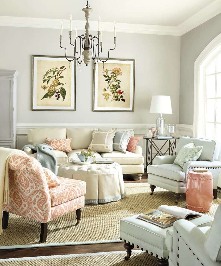
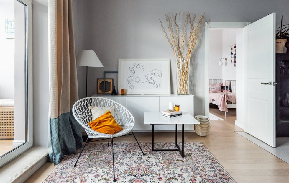
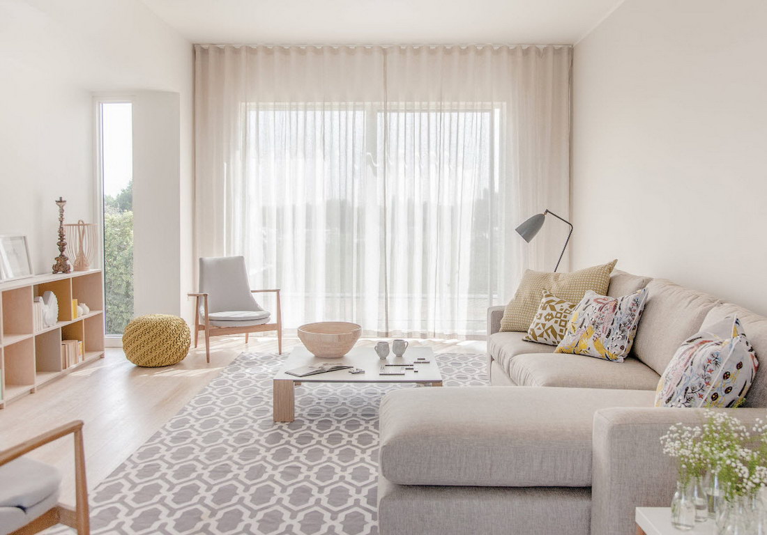
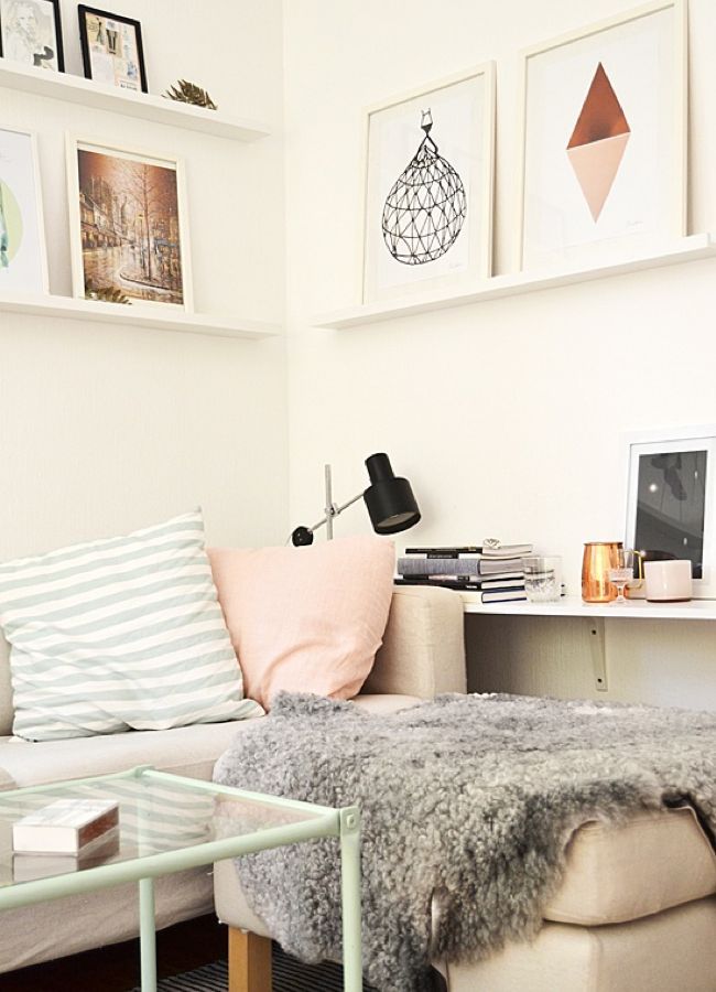
The perfect combination of colors for a soothing atmosphere that allows you to focus and tune into a working mood
It is important to consider the size of the room. For small rooms in Khrushchev, delicate paints without strong contrast will be appropriate. Light design will visually increase the room and create space. A medium-sized room can be framed in the same colors, or by adding 2-3 contrasting elements. You should not add more, otherwise the interior will look overloaded and oppressive.
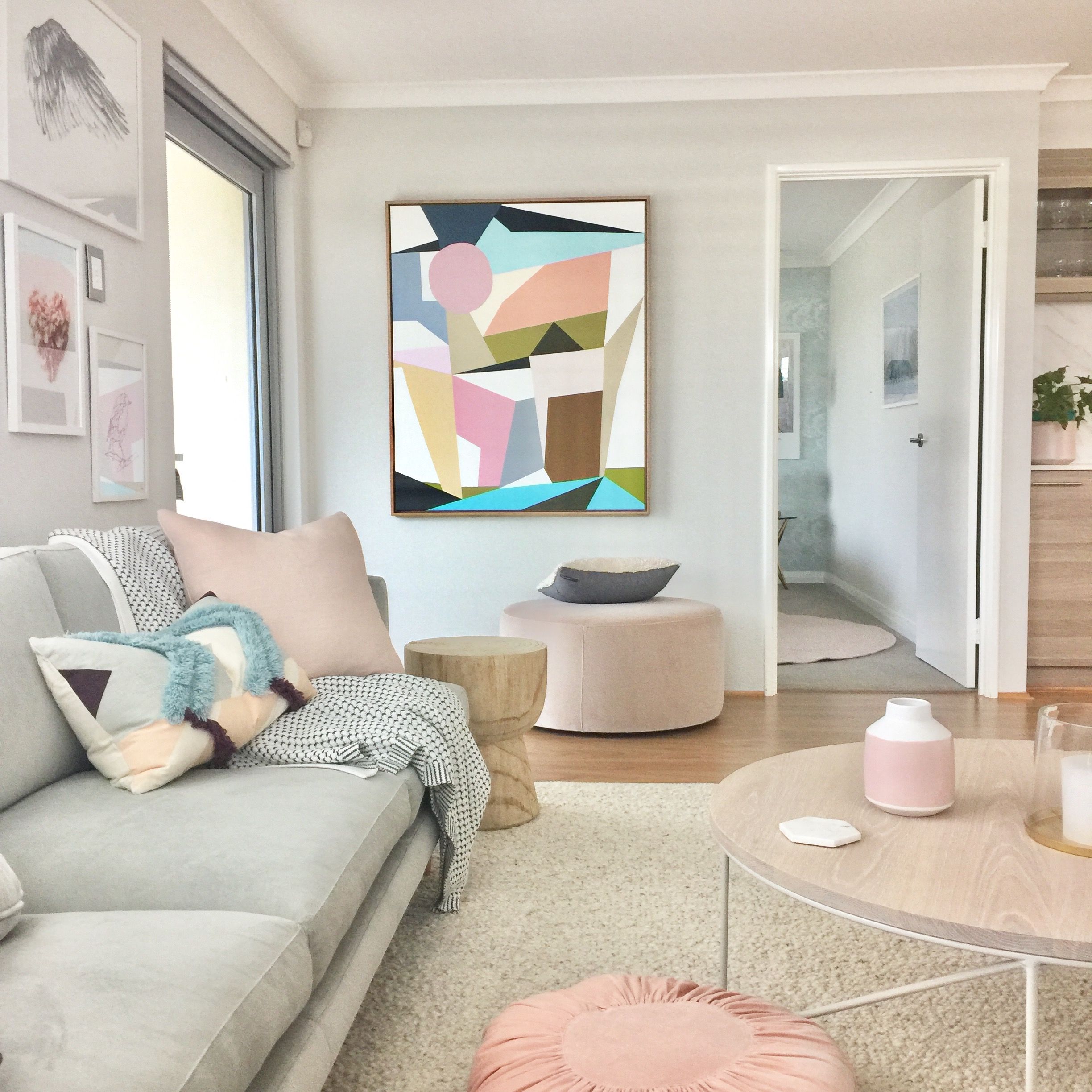
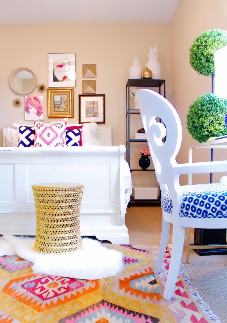
Harmonious combination of pastel colors, giving both peace and energy
A large room in one light color, on the contrary, will be so spacious that it is easy to get lost in it. In a huge bright room, you must either add contrasting elements or create a transition from one pastel color to another. In the first case, the dynamics of the interior will be noticeable.In the second case, smooth transitions of colors zone the room and create a gentle atmosphere with a touch of intimacy.
Warmly decorated living room will become a favorite place for pleasant gatherings.
Options for combining pastel colors with other colors
The combination of different colors and colors among themselves gives interesting results. The main thing - when combined with each other, do not overdo it and observe the basic rules of harmony.
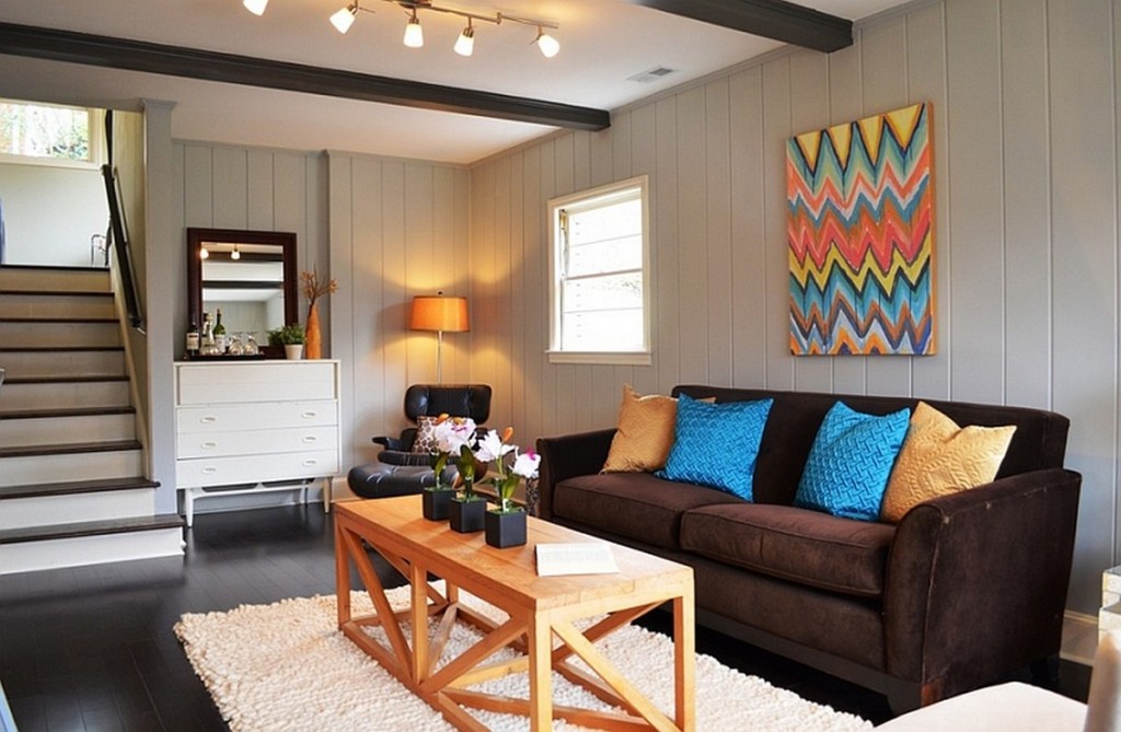
Bright paintings or posters look good on pastel walls
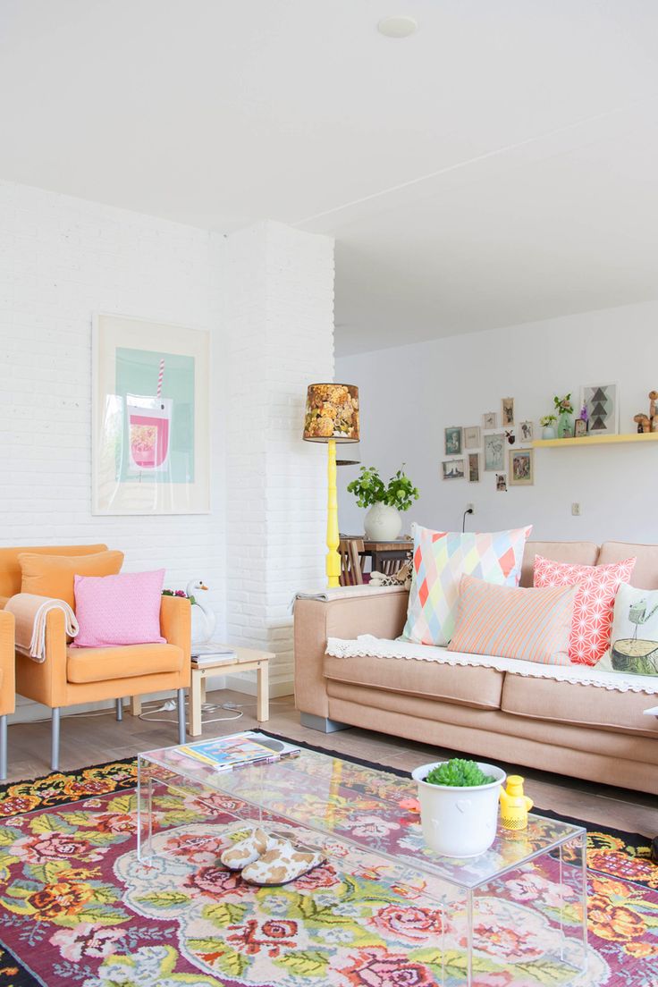
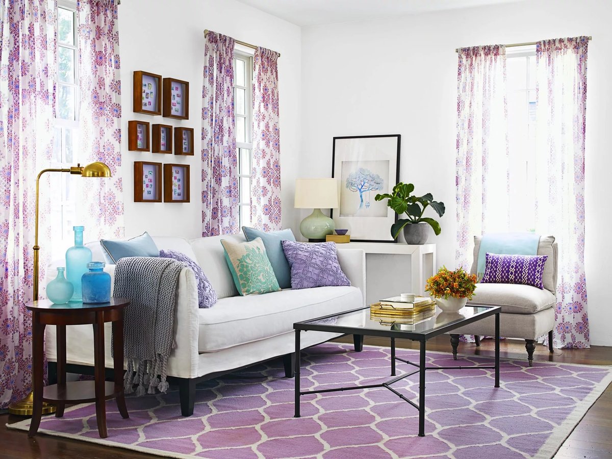
Colors can be combined according to the principle of analogy or by the principle of contrast. By the principle of similarity they combine paints that pass from one to another according to the rainbow spectrum. That is, yellow is placed next to orange, green next to turquoise, and that one smoothly turns into blue and then into purple. For a living room in pastel colors, such smooth transitions will be most welcome.
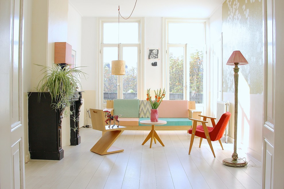
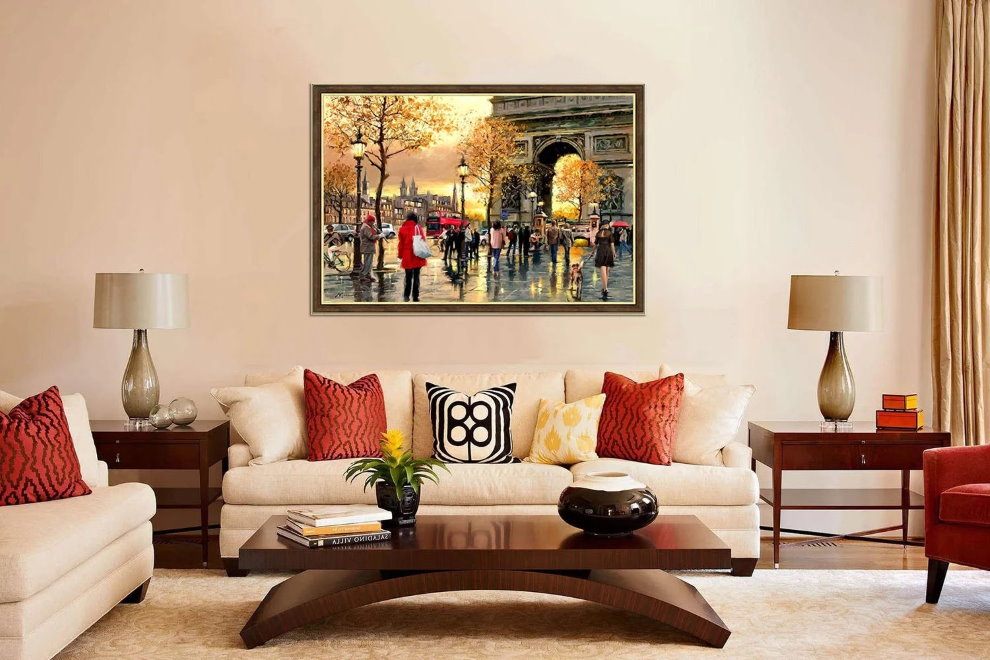
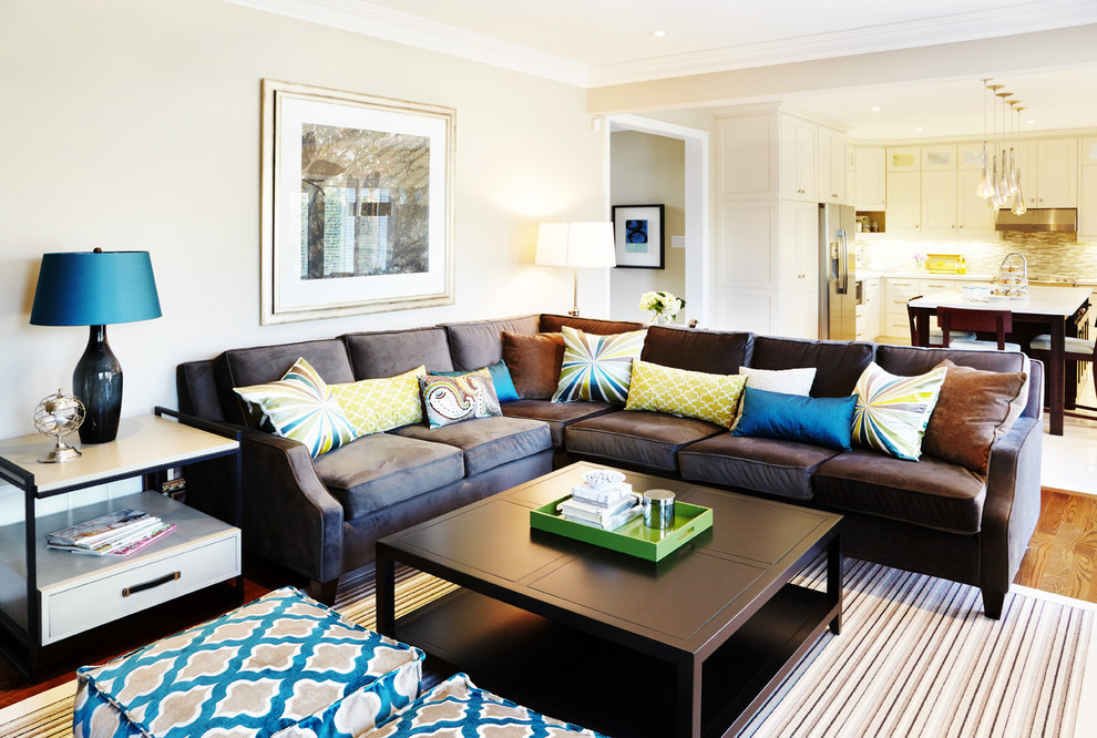
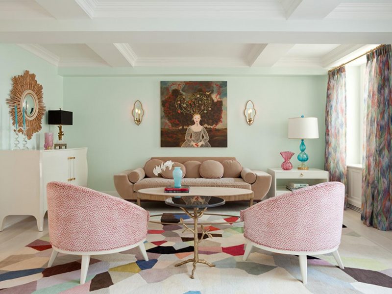
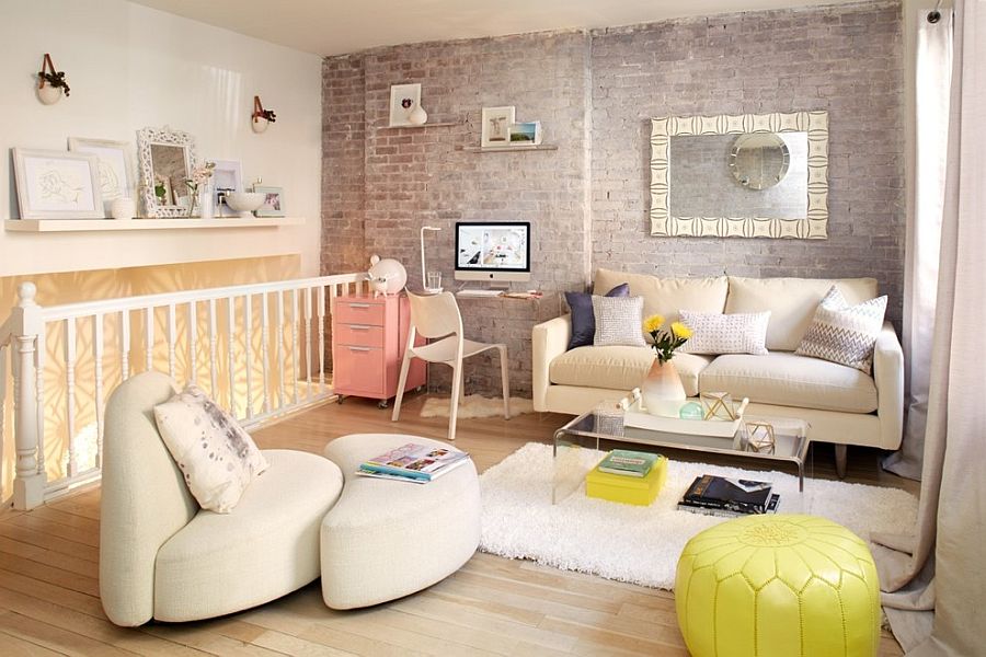
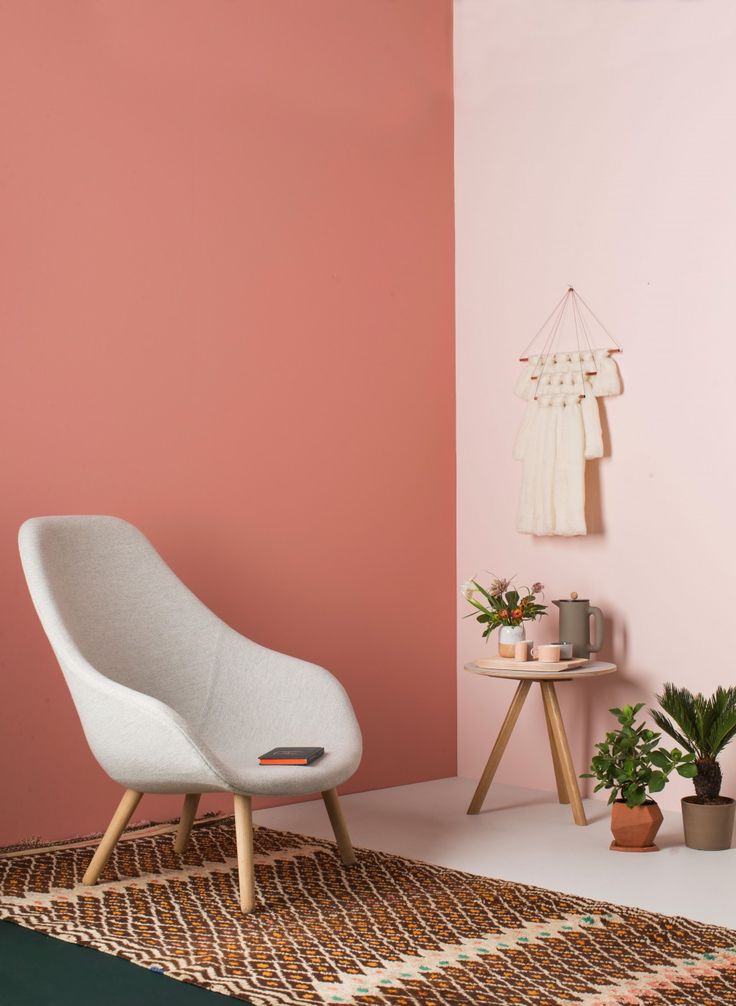
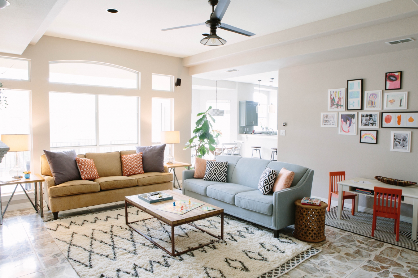
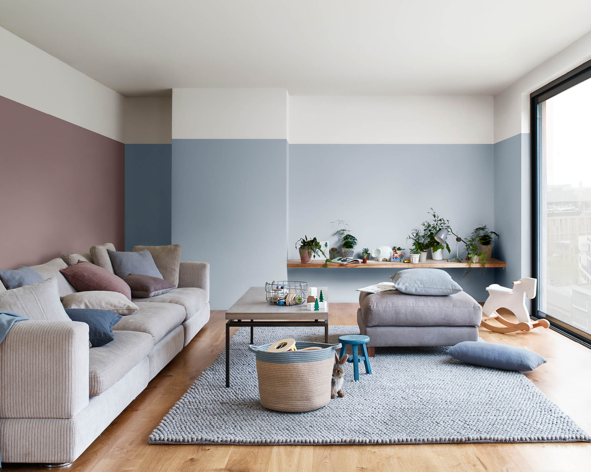
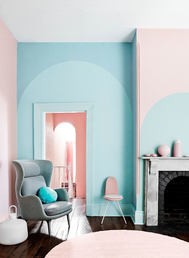
Spacious living room painted in contrasting pastel shades
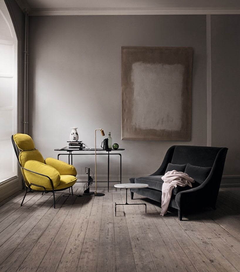
Contrast colors are combined according to the principle of opposites. Pale lilac will be appropriate next to the lemon, and beige-orange is emphasized by bright elements of blue. In this case, it is better to choose one color as the main one, it will be lighter than the others. Others will be complementary and only individual elements will be painted in them: pillows, vases, paintings.
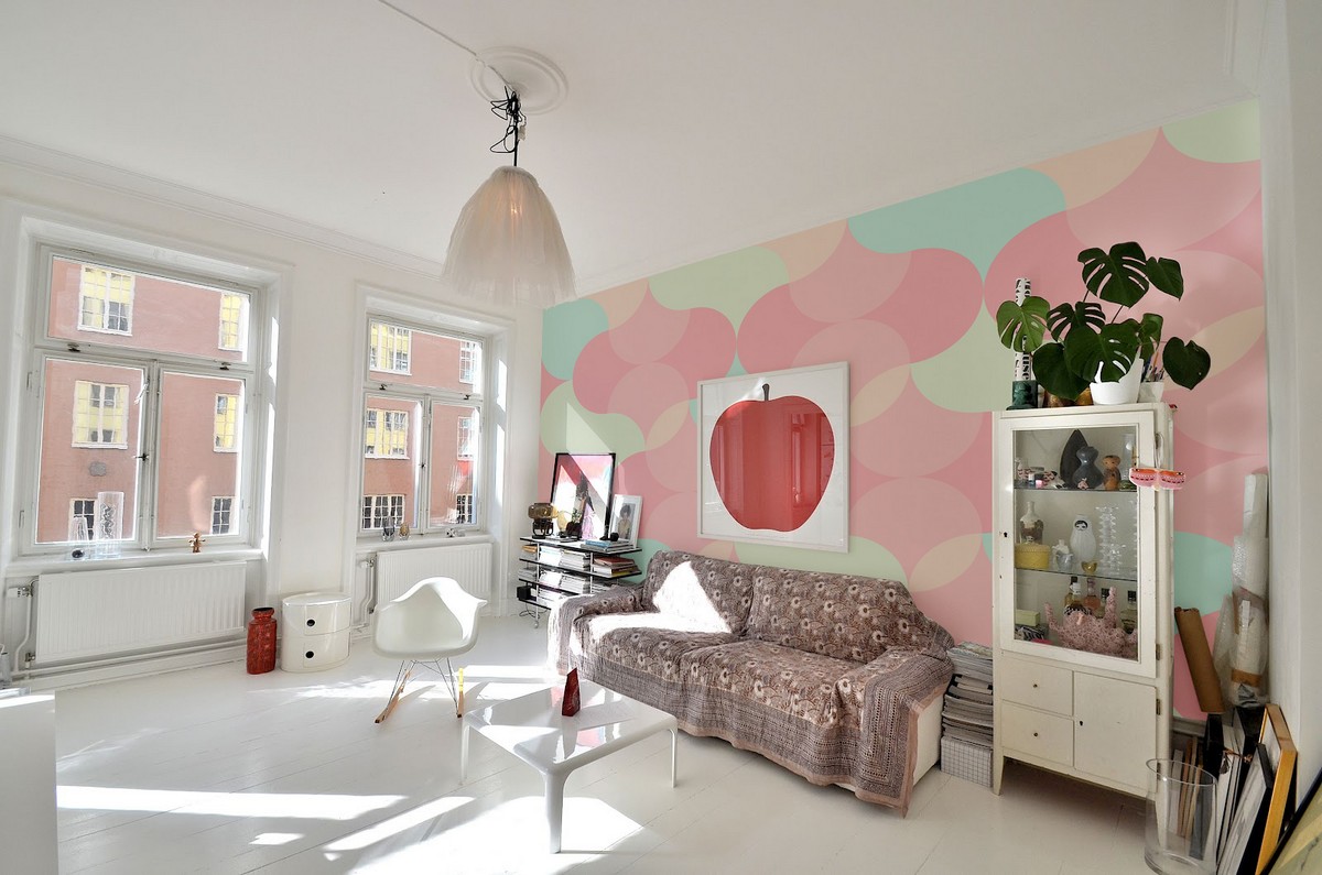
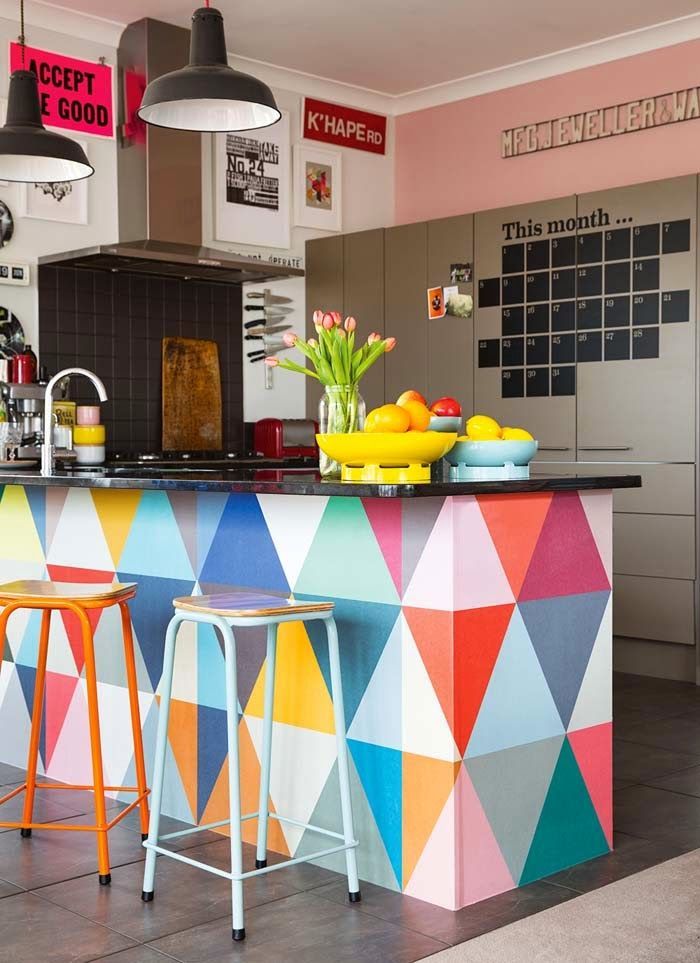
Creative wall design in contrasting colors
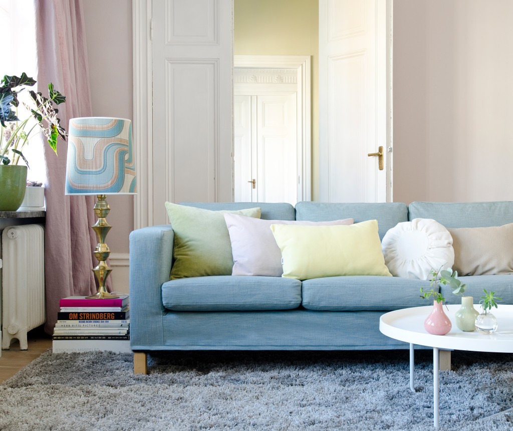
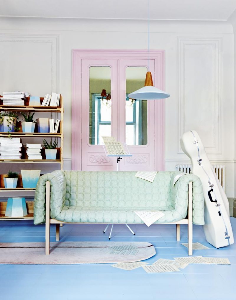
More gentle is the use of shades of the same color: for example, from soft cream to chocolate, or from soft blue to blue.
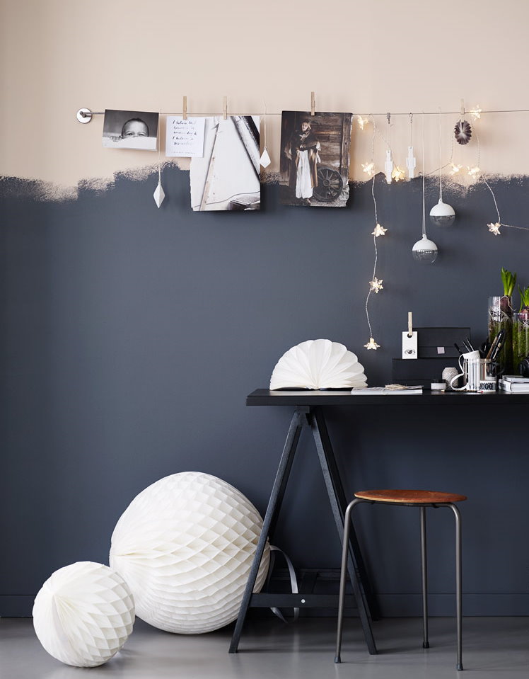
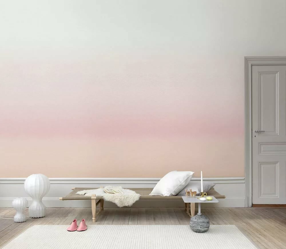
Gradient wall painting is now in fashion, allowing you to create unique interiors.
It is important to consider lighting options. In daylight, all objects appear lighter and colder. With artificial lighting, the colors become warmer.
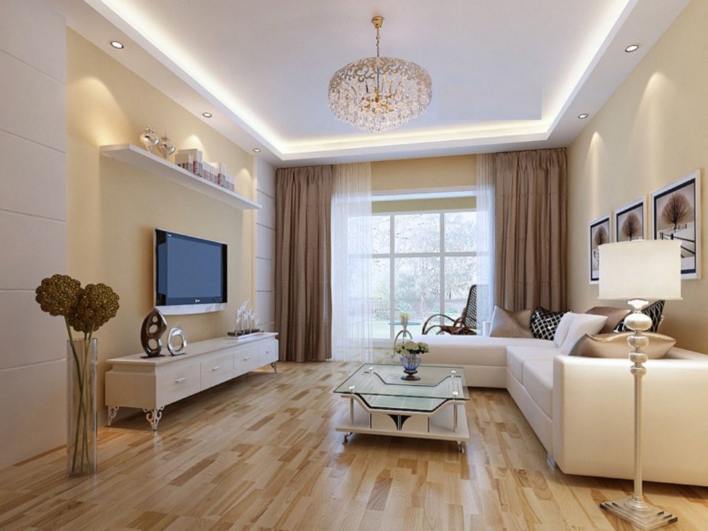
Calm beige interior, slightly diluted with living plants
A game of colors can create small details. In the living room of pastel colors, white wallpaper patterns on the walls, white stucco molding on the ceiling, and decor elements on furniture will be appropriate.
The interior in pastel colors will be the best solution for those who want to create a light and airy atmosphere.
A selection of popular pastel colors for design
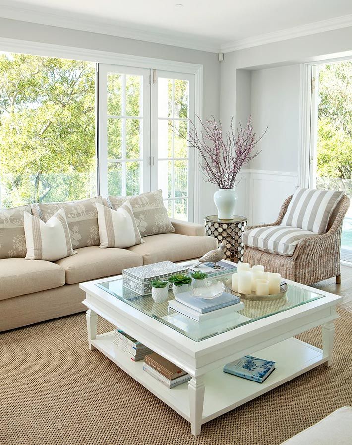
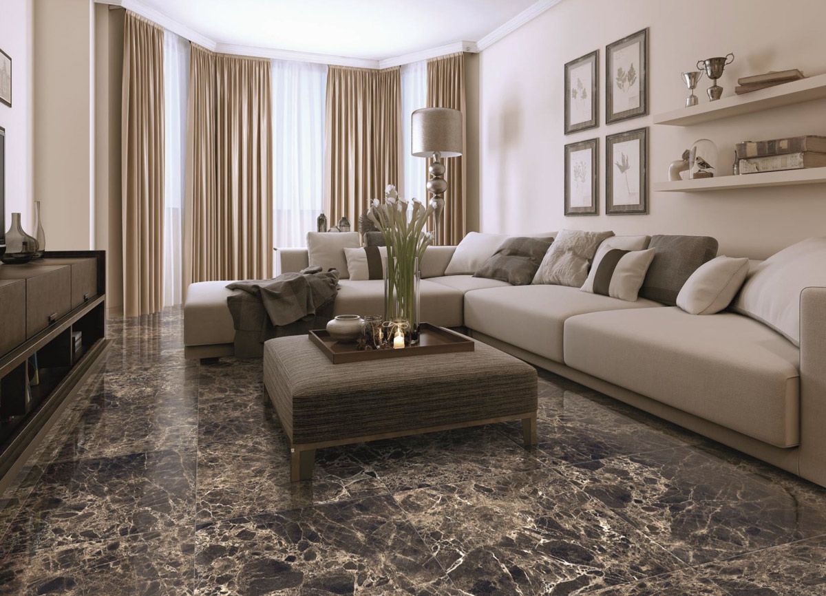
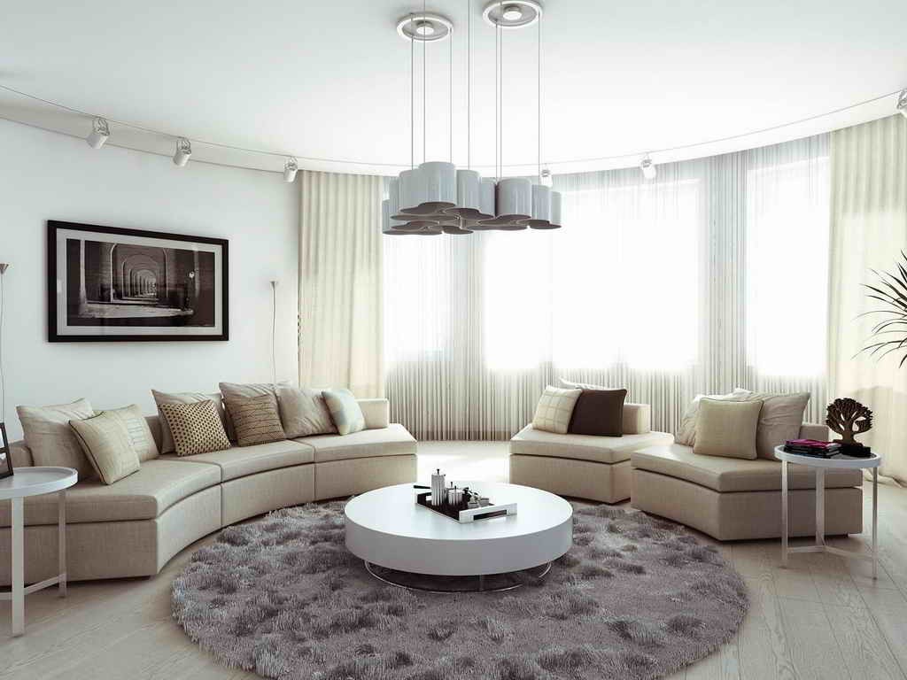
Beige will suit any interior - be it a classic, Scandinavian style, high-tech or loft. It is most popular in room decoration, as it adds nobility to the interior. It will be ideal with any materials: wooden furniture, brick walls, paper or vinyl wallpapers, metal objects - all this in a beige version will look good.
Beige tones in the interior of a small living room of a modern style
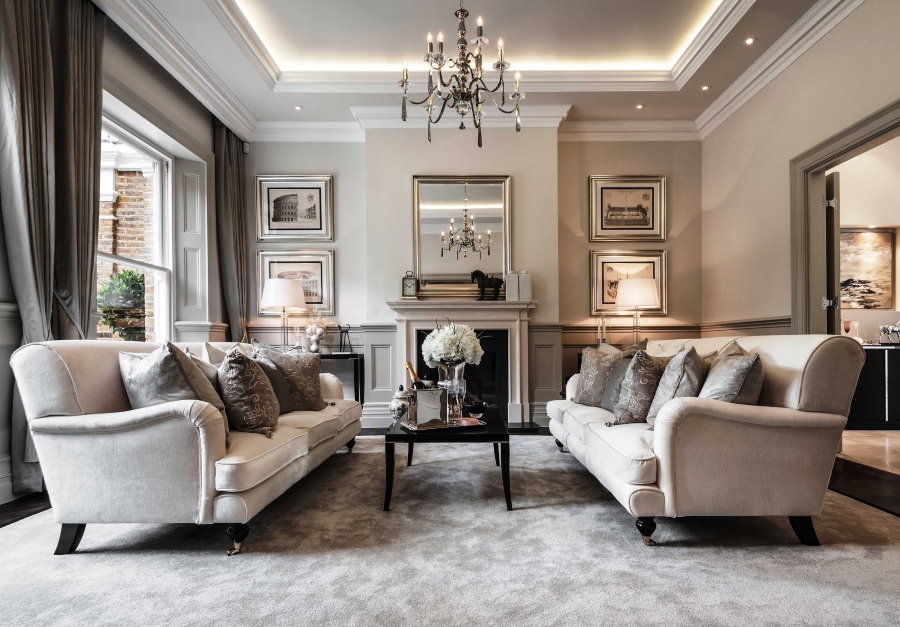
Spacious neoclassical style living room with beige walls
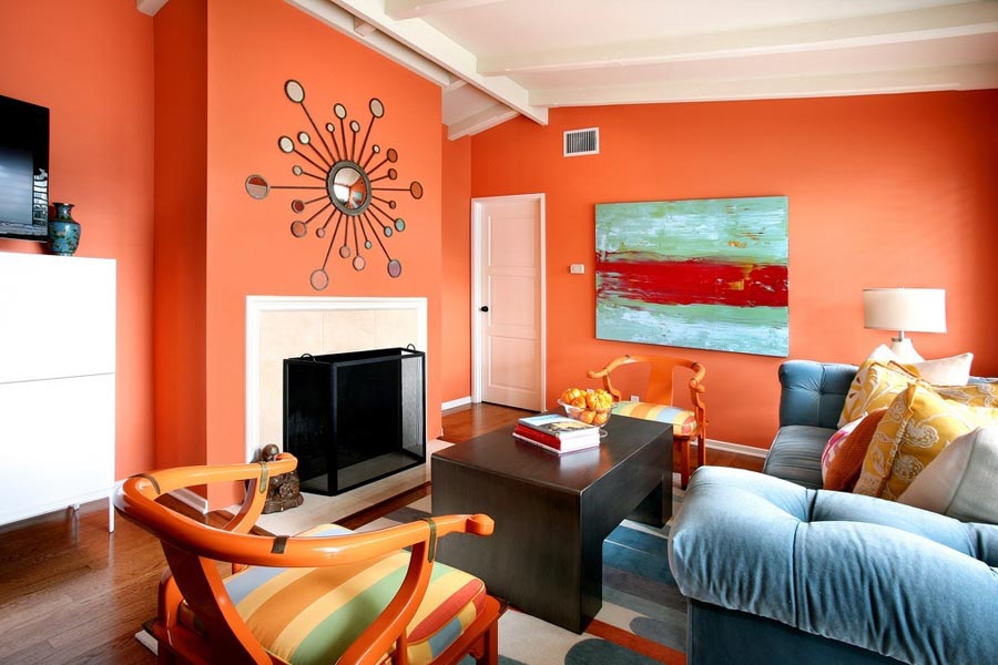
If you want to add dynamics, then chocolate or brick accents will be perfect. For lovers of bright colors, beige will also come in handy - it perfectly dilutes the red living room.
Dark brown furniture blends perfectly with creamy wall finishes.
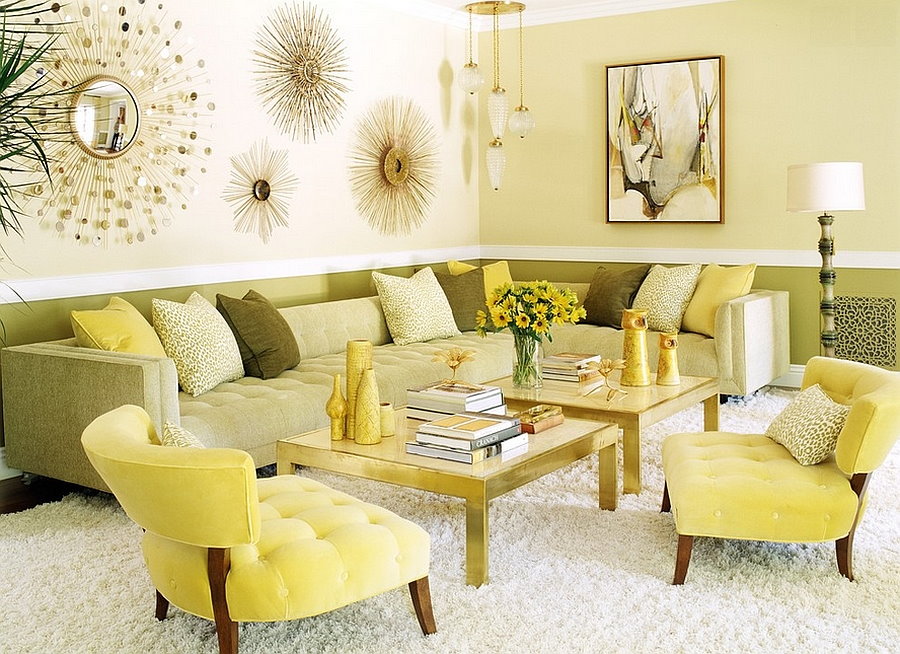
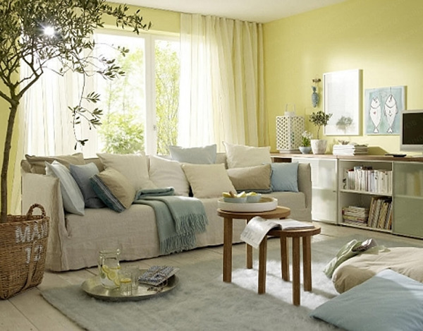
Yellow is akin to beige. It will look good in a classic or modern interior. Moreover, it can be of different shades - from delicate lemon to peach. The yellow living room creates a feeling of happiness and joy. Lemon will look good in a small room of ordinary Khrushchev.
A yellow sofa set along a light wall will add freshness and beauty to the interior
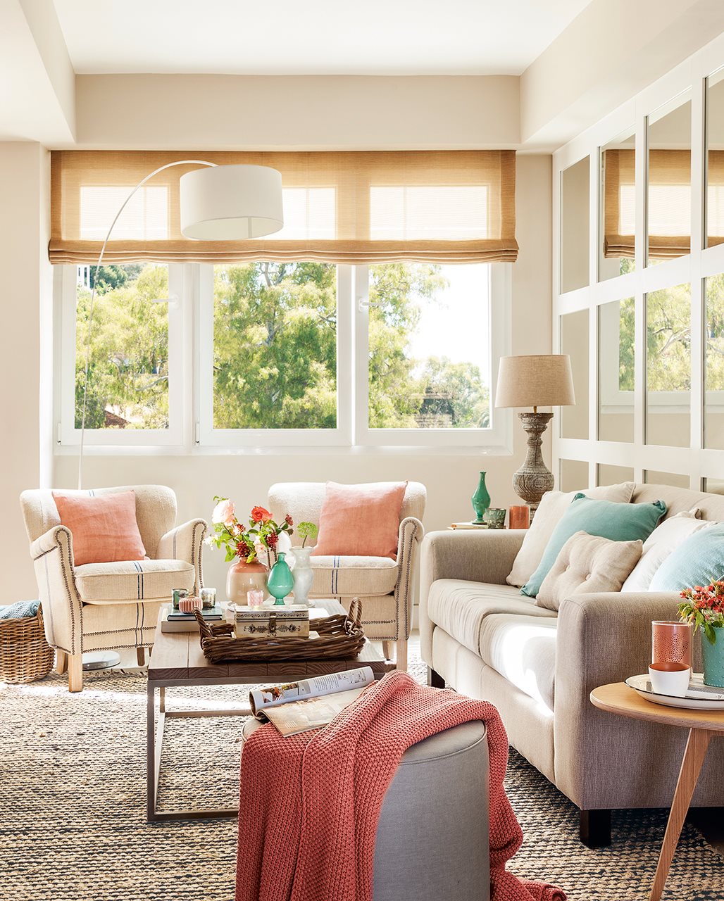
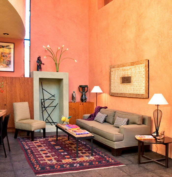
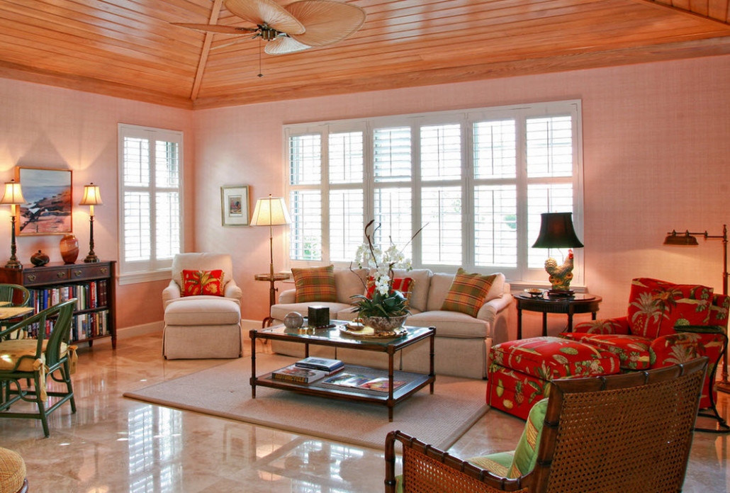
The peach-colored living room will look warm and cozy. Peach is suitable for a large hall or for placement on the north side. At the same time, yellow must be handled very carefully - in some cases, objects from it may look dirty, it can begin to irritate over time.
Peach color pastel looks good together with bright decorative accessories
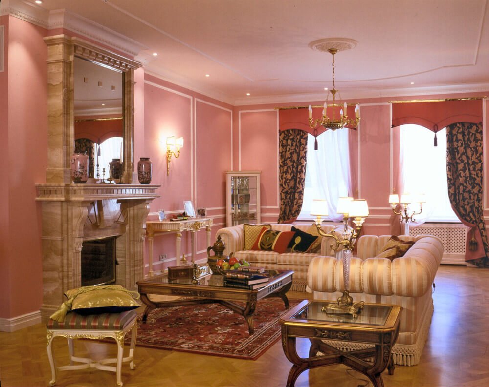
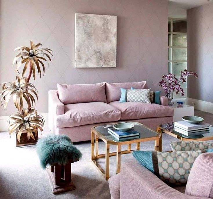
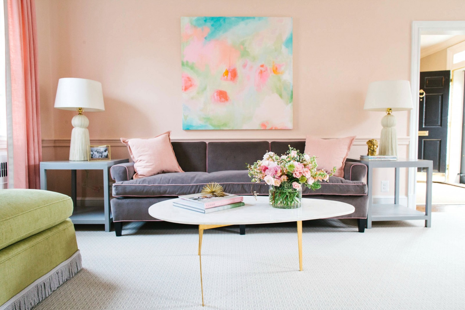
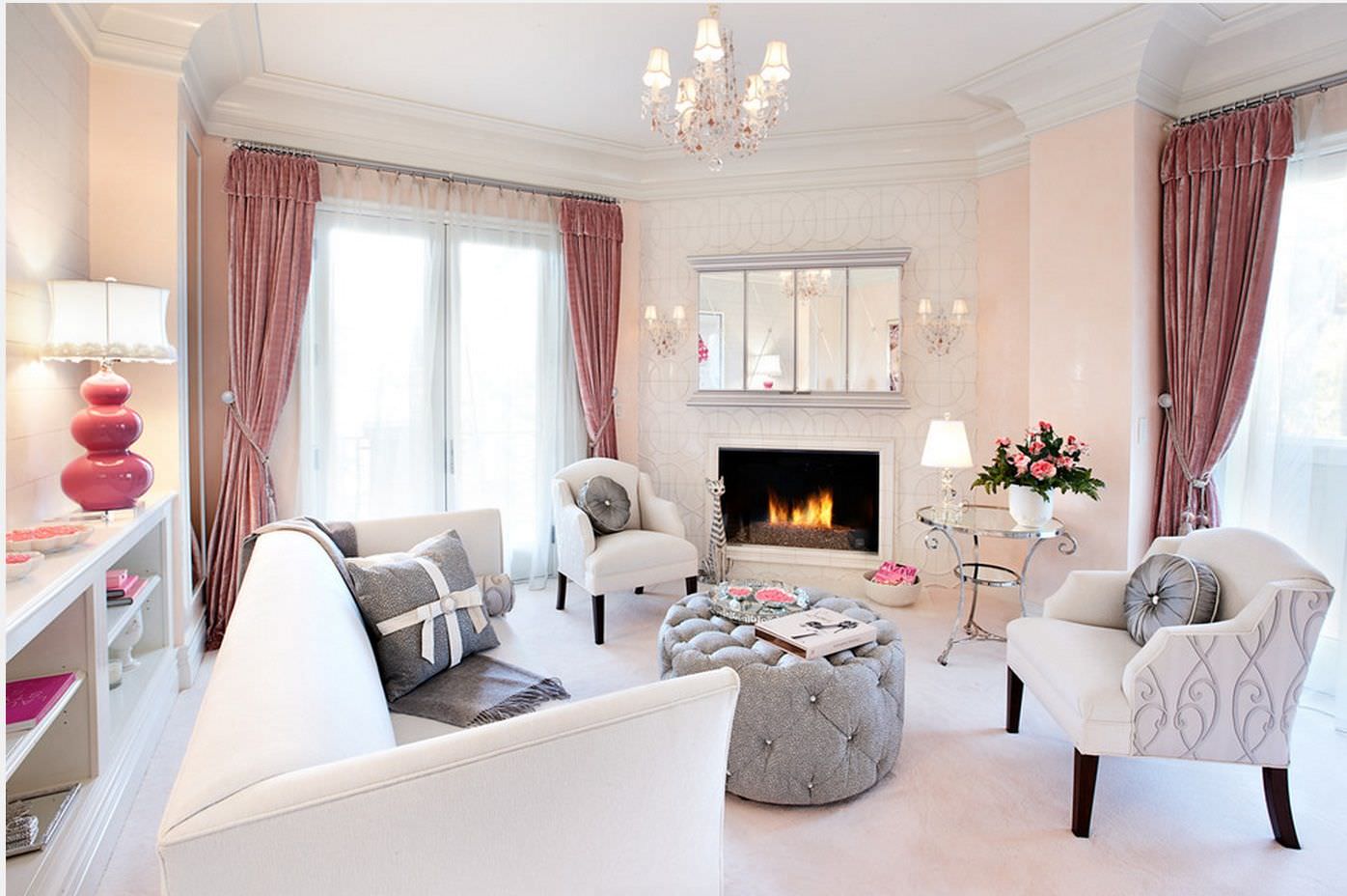
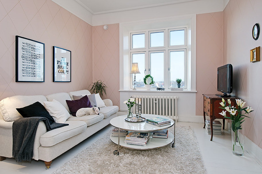
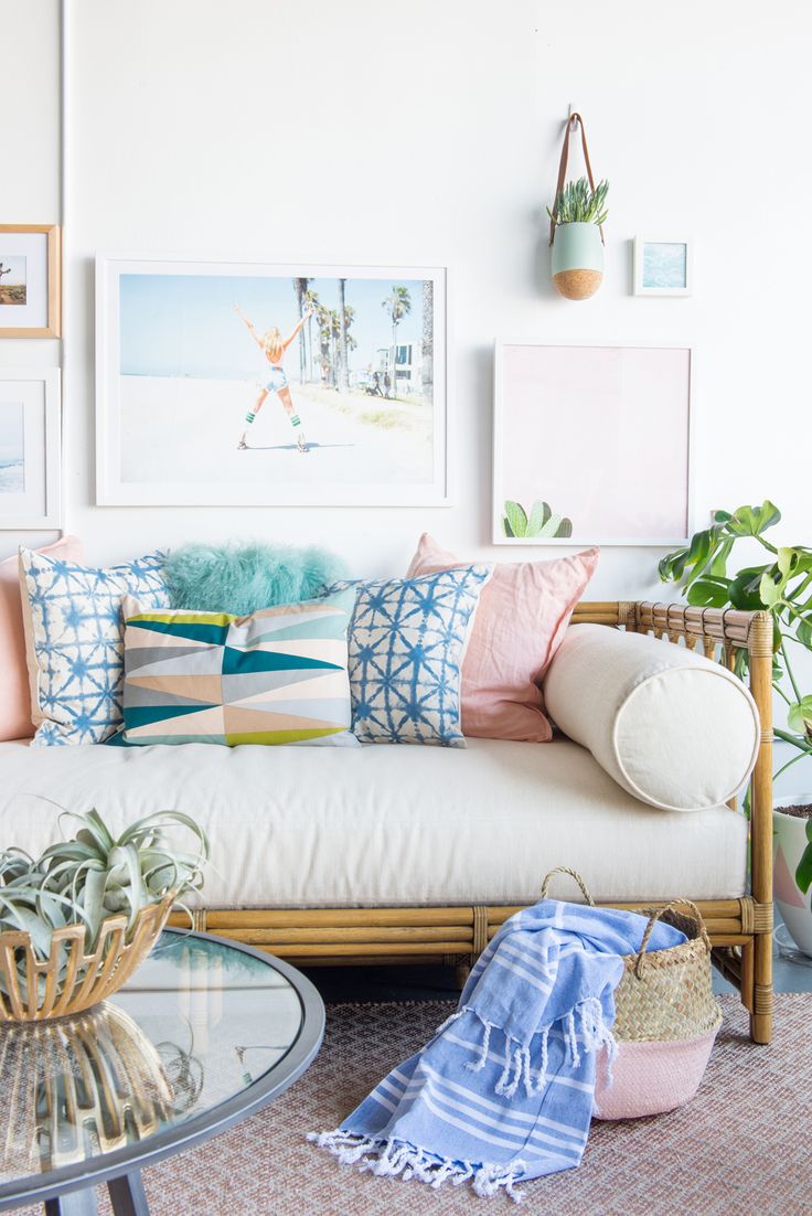
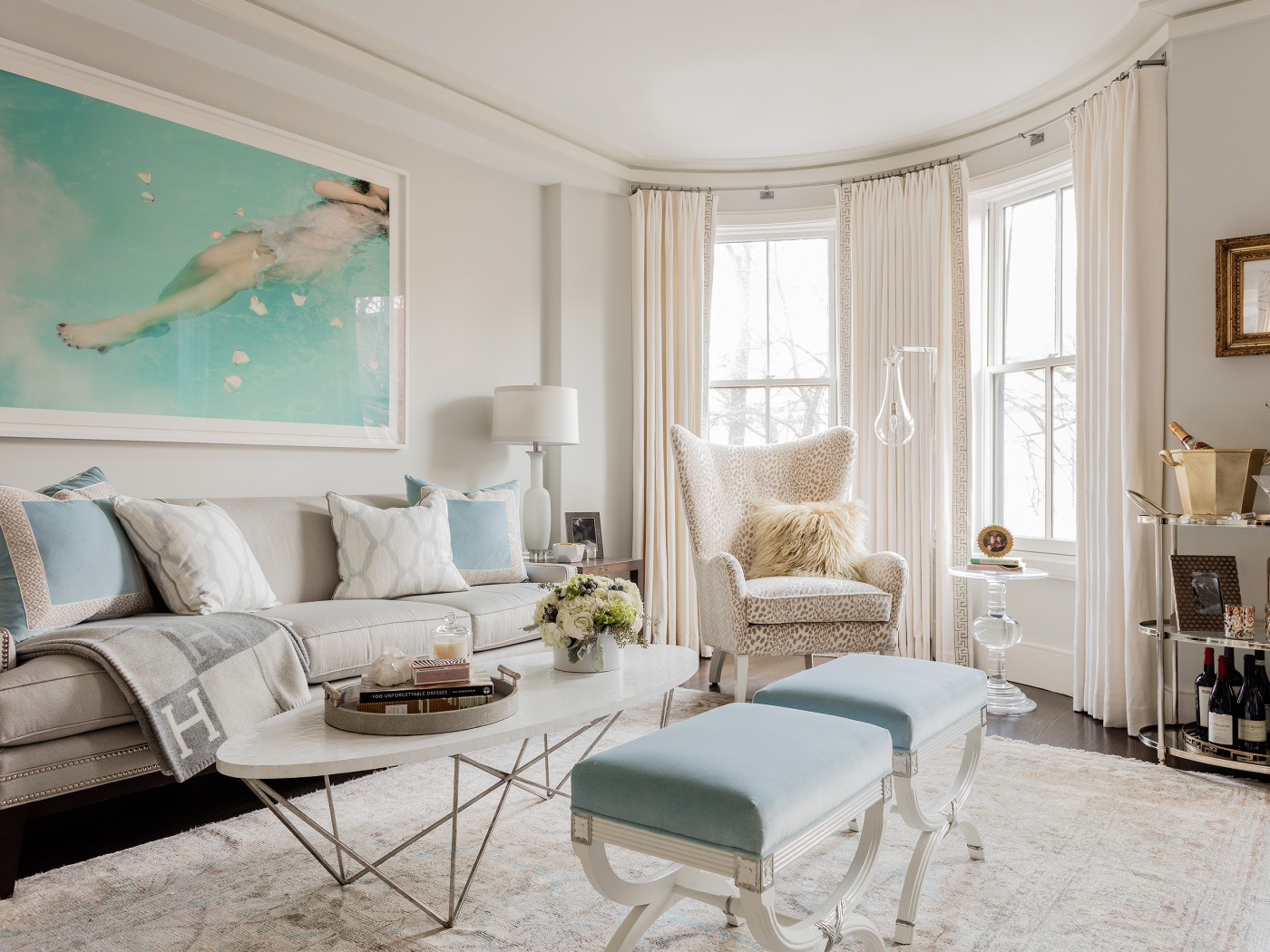
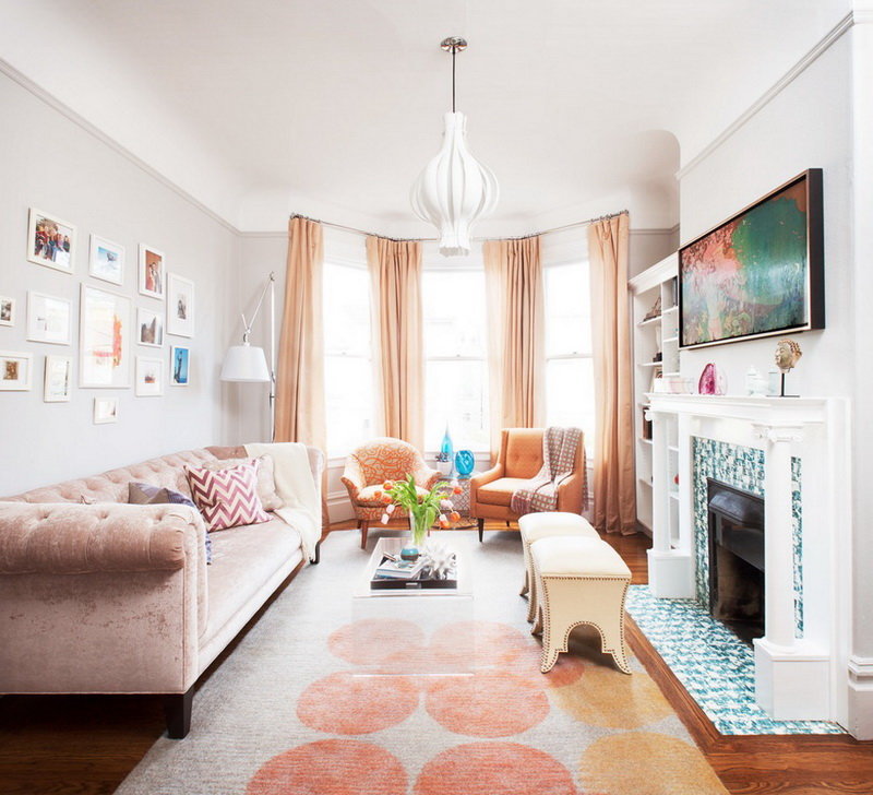
Pink creates a feeling of tenderness, bliss, romance and helps to relax. Perfect for classics.However, pink attracts attention, so in the room it must be diluted with other neutral colors - white, light gray or beige. Otherwise, the interior will look a little oppressive. When used in large rooms it is wise to add accents of blue.
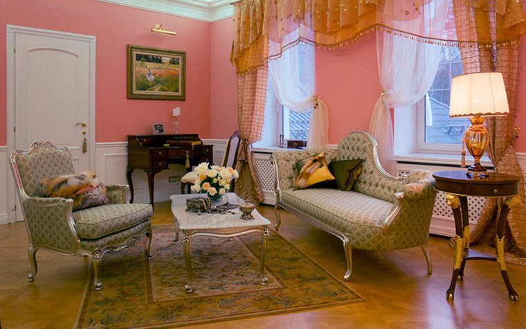
A classic pink living room with a fireplace, the portal of which is decorated with a large mirror
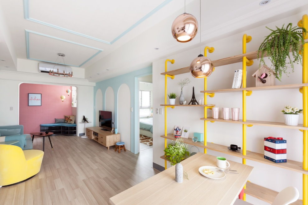
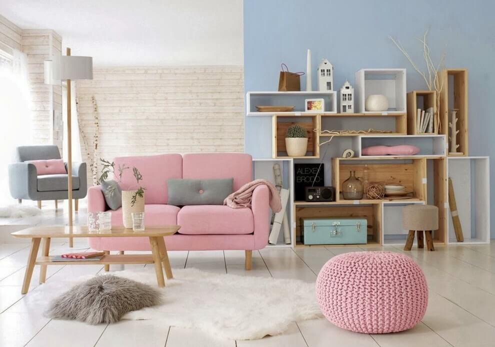
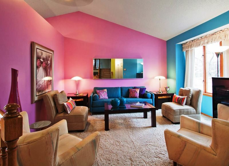
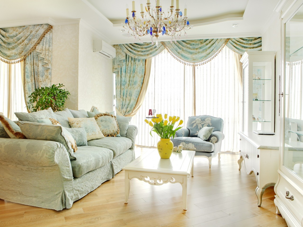
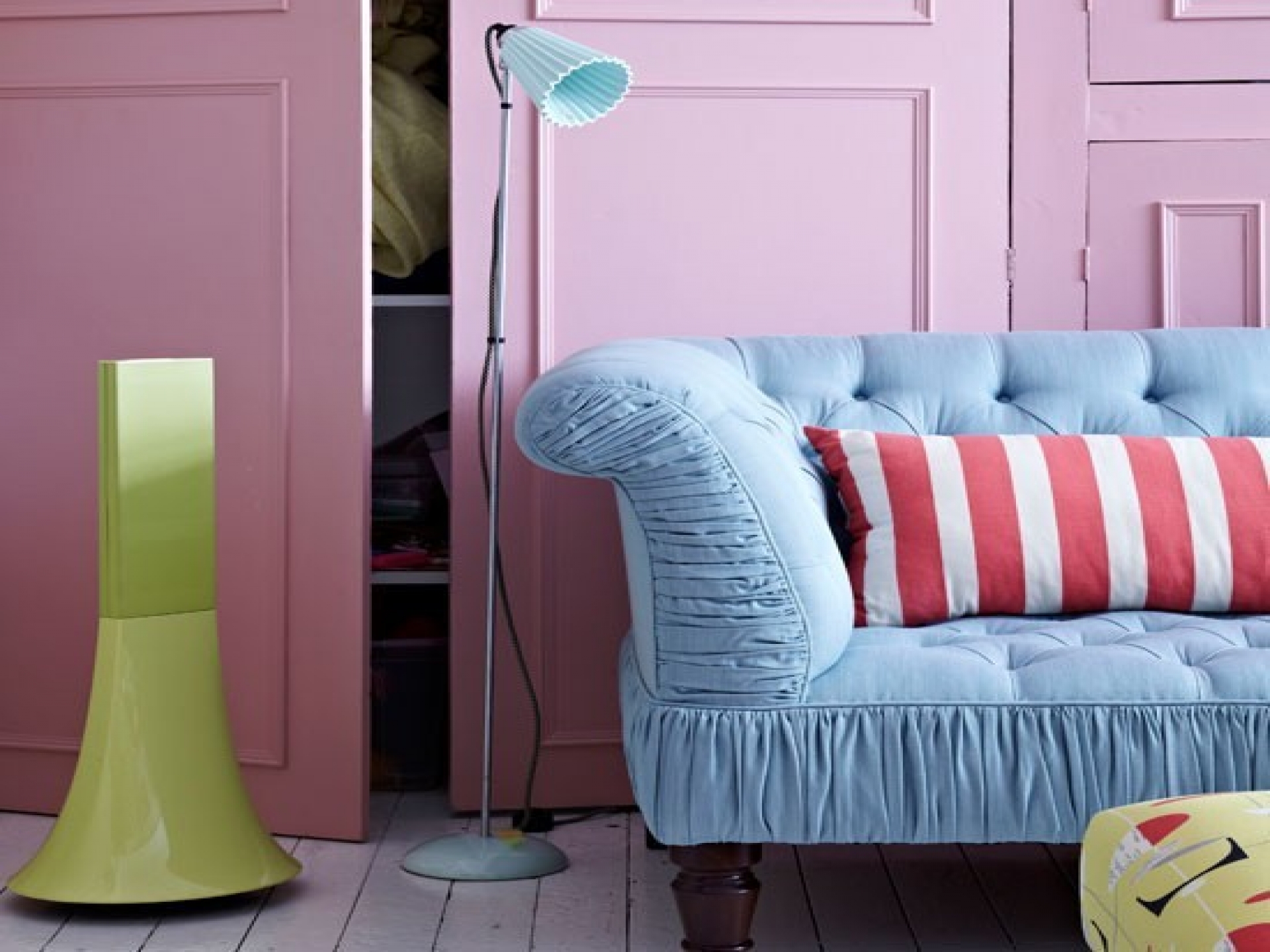
A harmonious combination of pink and blue in a mixed style living room
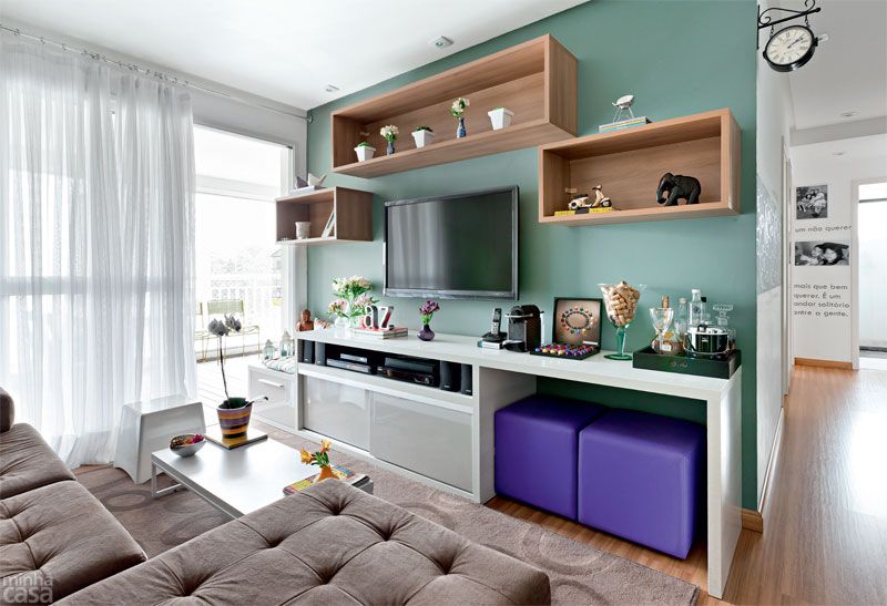
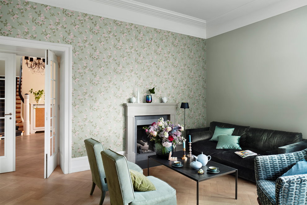
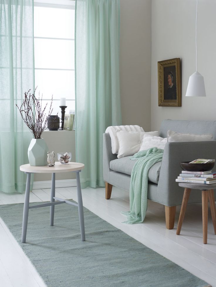
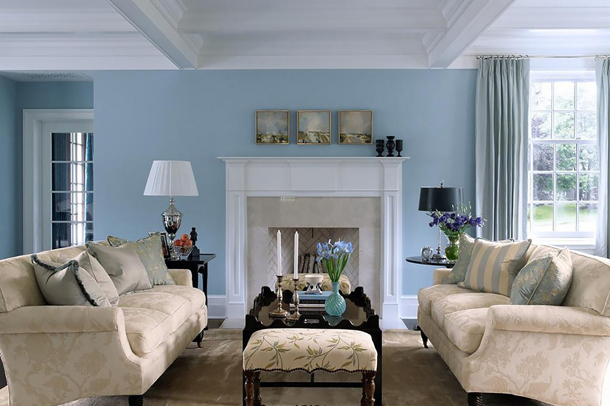
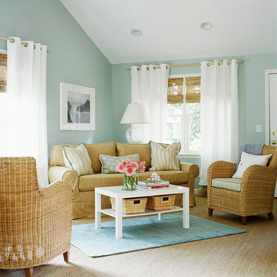
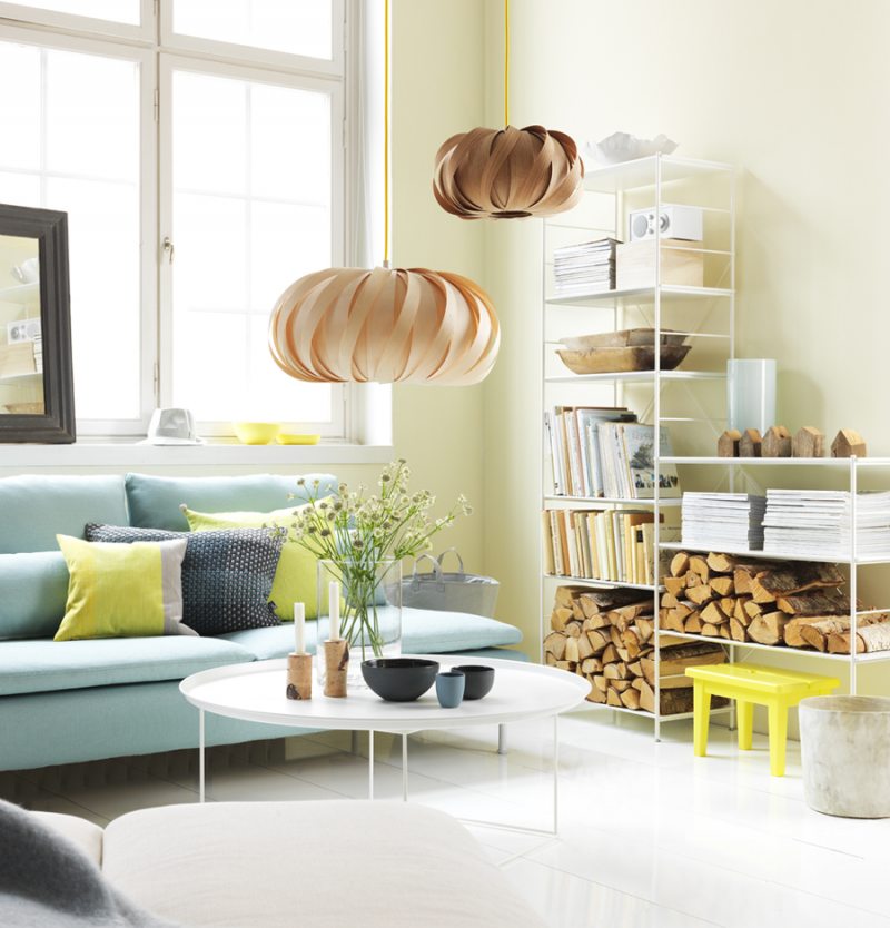
Blue and turquoise create a feeling of freshness, coolness. Living room in blue tones promotes concentration and concentration. Colors are suitable for classic and art nouveau styles. The blue living room is suitable for the south or west side. Blue, blue, turquoise - all of them successfully combine with most other colors, so you can use it in a large room for zoning.
Against the background of the turquoise wall, hanging shelves with wood trim will look great
Decorating the room in pastel colors
When designing a room in pastel colors, the main role is played by wallpaper. It is important to pay attention to the material - non-woven or vinyl wallpapers are suitable. They wash well and are resistant to pollution. For light walls, this is very important.
Light gray striped beige wallpaper in a cozy living room.
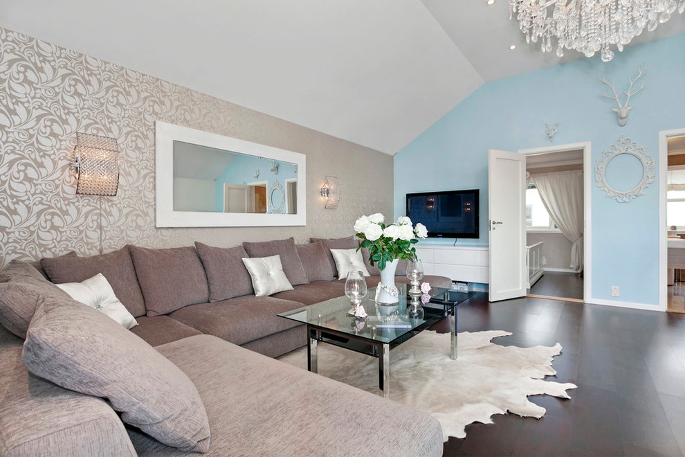
Light wallpapers combined with an accent wall in blue
Such options for selecting wallpapers will look stylish:
Patterned tone below or above the background.
Smooth light tone with bright accents of other design elements.
Bright saturated color with pastel decor elements.
Light wallpaper with an unobtrusive pattern in the Scandinavian style living room
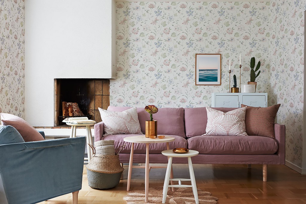
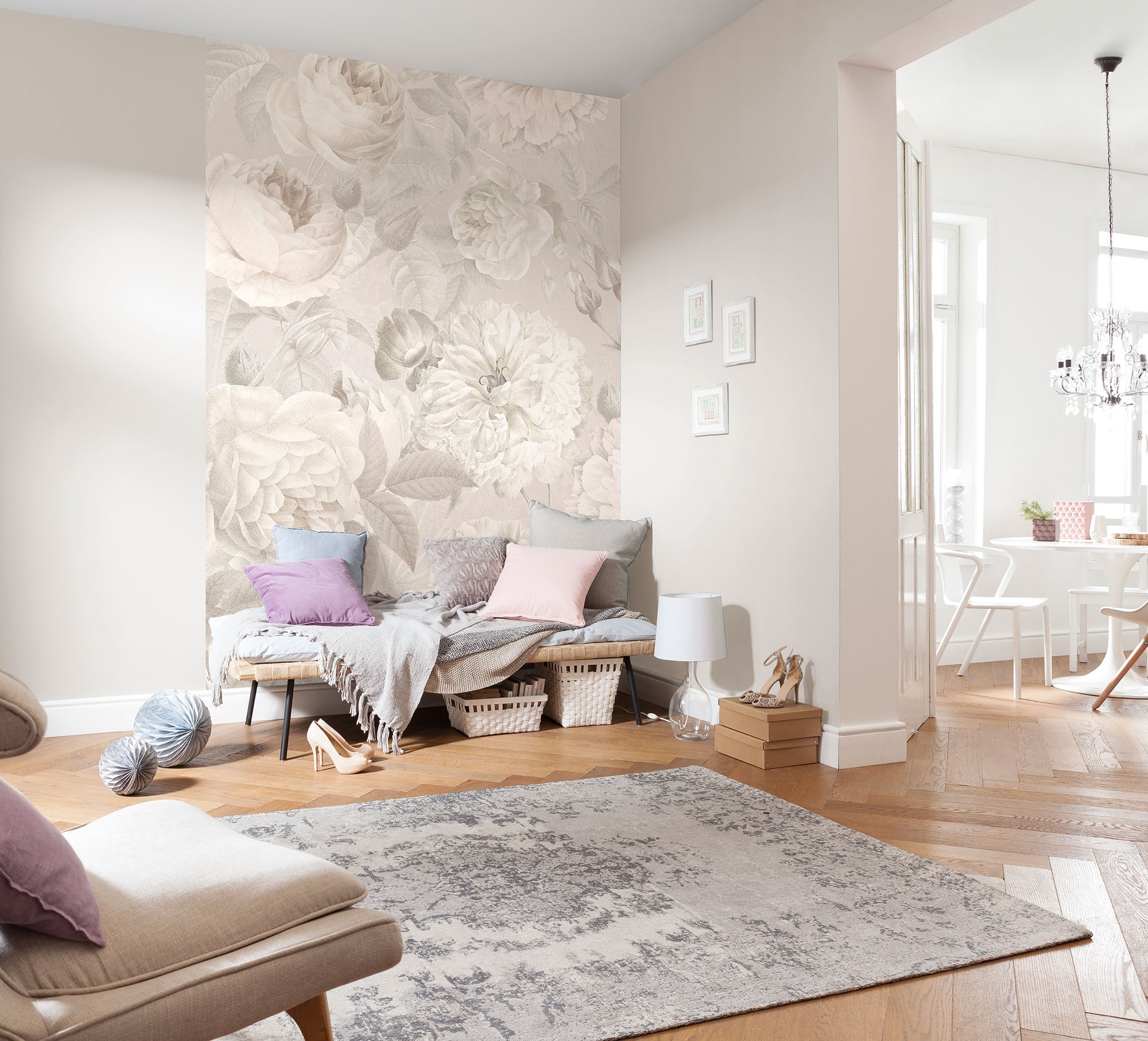
Pastel floral wallpaper in the living room with fireplace
The most important thing is that the living room in pastel colors please the owners and we would like to stay in it.
Video: Stylish living room interior design in pastel colors
Want to keep up to date? Of course, it is not necessary to follow all the latest fashion. Moreover, they often reach the point of absurdity. It’s enough to have an idea ...
Such a room as a living room in any house or apartment becomes a reflection of personality. Therefore, it is worth paying special attention to the design of the living room ...
Every family about once every five years is overwhelmed by the problem of choosing wallpaper during the repair. As a rule, this process takes a fairly large number of days ....
In any house or apartment, the living room plays an important role, because in this room all significant events in the life of the family take place. The living room is not accidentally called ...
The most pleasant place in the house where you can allow yourself to relax after a hard day or spend a fun evening with friends is the living room. Room,...
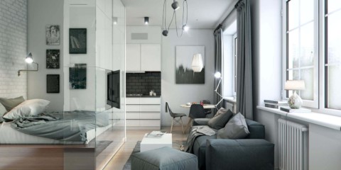
 Living room
Wall decor in the living room in a modern style
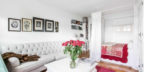
Living room
Wall decor in the living room in a modern style