homeKitchenHow to take advantage of the gray palette in kitchen design
How to take advantage of the gray palette in kitchen design
During the repair in their own home, everyone tries to recreate the interior, which will harmoniously combine beauty, practicality and comfort. When it comes to decorating the kitchen, many are lost among the abundance of the color palette and cannot choose a starting point for the idea of the overall style of the room.
We suggest you consider the most profitable and versatile option - a kitchen in gray tons. This color has a large gamut of shades, so any person can easily choose the most suitable one for themselves and their loved ones.
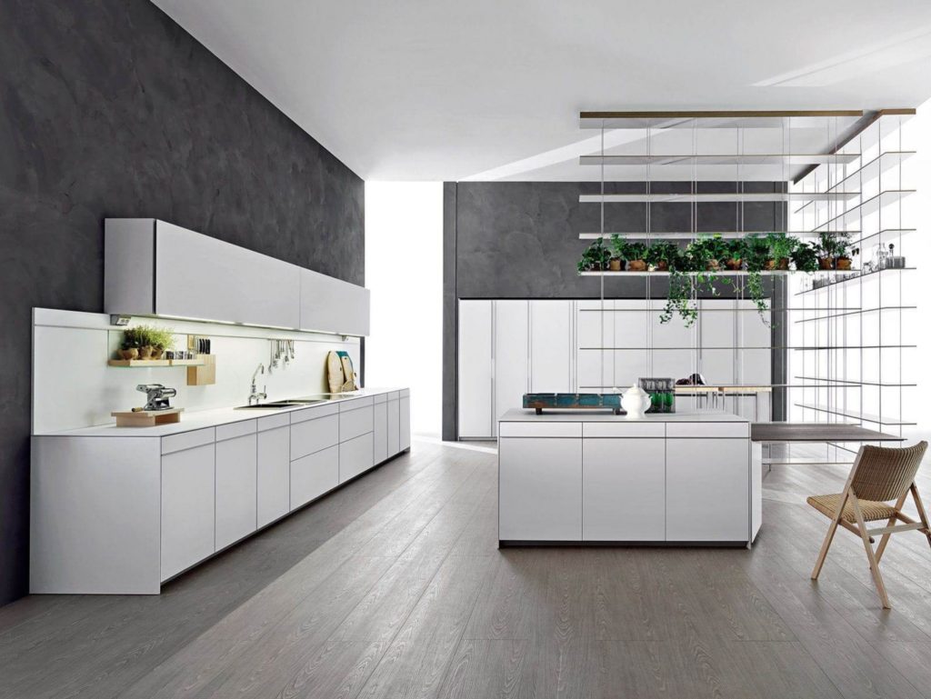
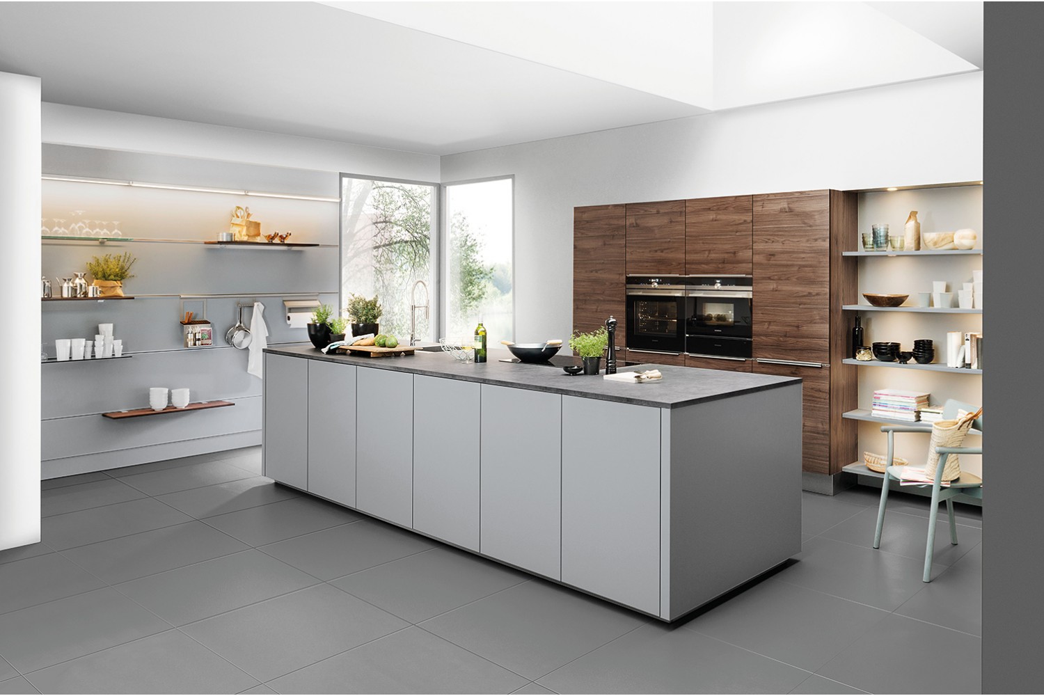
Designers love gray for the opportunity to combine it with other colors
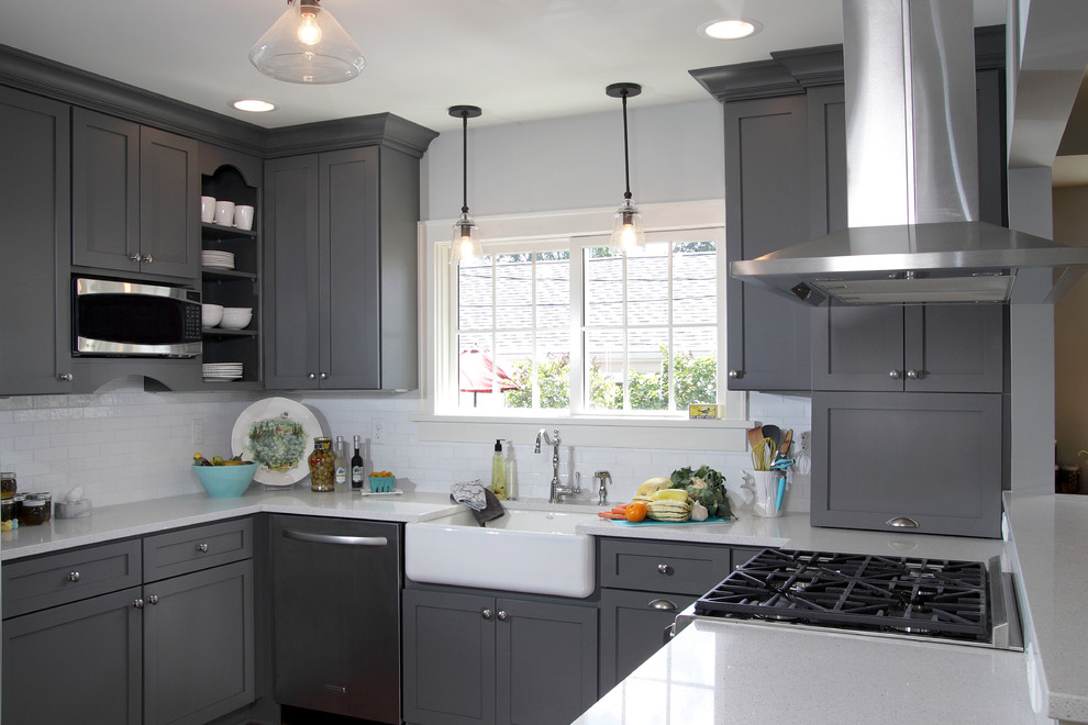
Perhaps you think that the interior of the gray kitchen from the side looks very gloomy? This is an absolute delusion! Professional designers have long identified gray color among the rest, and often use it as the basis for decoration of various rooms. It blends perfectly with all existing colors, which makes it possible to bring original design ideas to life.
It is noteworthy that the gray color can be accommodated in any style of interior from a strict "classic" to the modern "modern". They are often replaced with white and beige shades, since it looks more favorably in the environment and positively affects the psycho-emotional state.
Housewives, and the whole family as a whole, spends a large amount of time in the kitchen, so it is extremely important to create a pleasant and calm atmosphere in it. Before deciding to use gray, consider its main characteristics.
The right combination of colors with a gray tint favorably affects the emotional background and soothes households. With a long stay, the palette is not annoying and does not cause fatigue.
Ability to create different color combinations. Anyone will be able to design a unique interior on their own. To do this, you just need to correctly set the color accents (read about the beneficial combination of shades below).
You will get a modern, very fashionable and relevant interior, as the gray palette has been at the peak of popularity for many years. Because of its versatility and practicality, most professionals and amateurs prefer this particular tone.
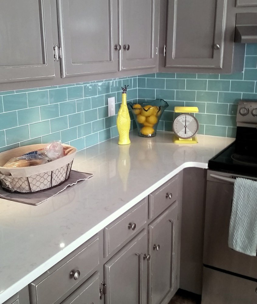
Importantly, gray, for example, is easier to clean than white, and traces of stains (which is always a problem for kitchens) are less noticeable on it.
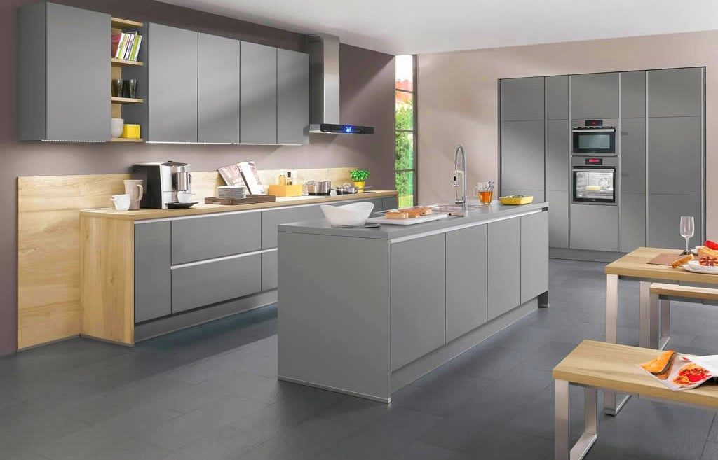
Manufacturers of appliances for home and furniture often finish the facades of manufactured items in gray tones. So, you will not have problems with the choice of kitchen utensils and interior components.
Tip 1: “If the kitchen has a small area, give preference to light shades of gray. This will create an optical illusion and visually expand the boundaries of the room. For owners of large-sized premises, the range of color palettes is not limited. ”
Light gray will expand the space of the kitchen
Tip 2: “To get a truly comfortable interior, dilute the main color with other colors. Especially this item applies to kitchens with poor lighting. "
Lighting flares will make the interior voluminous
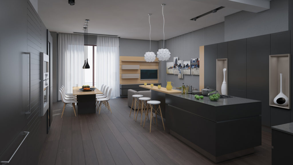
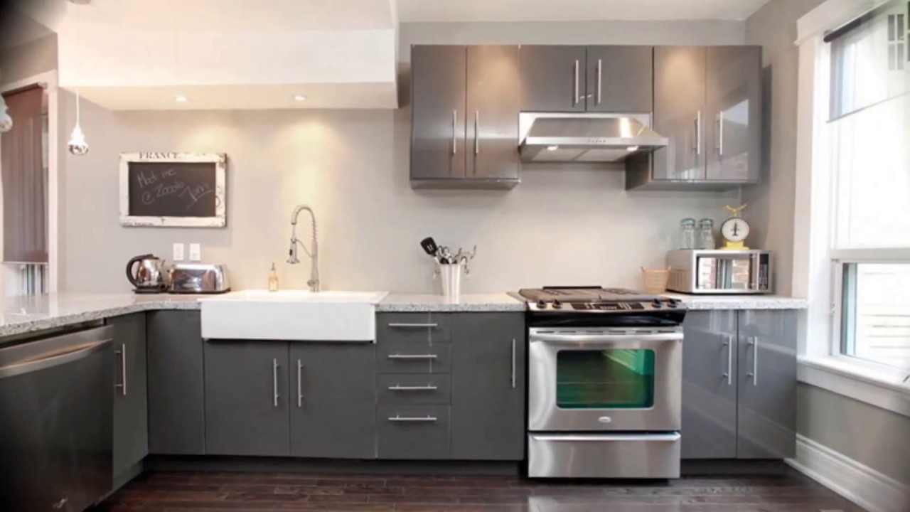
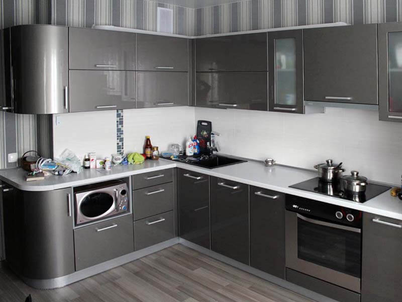
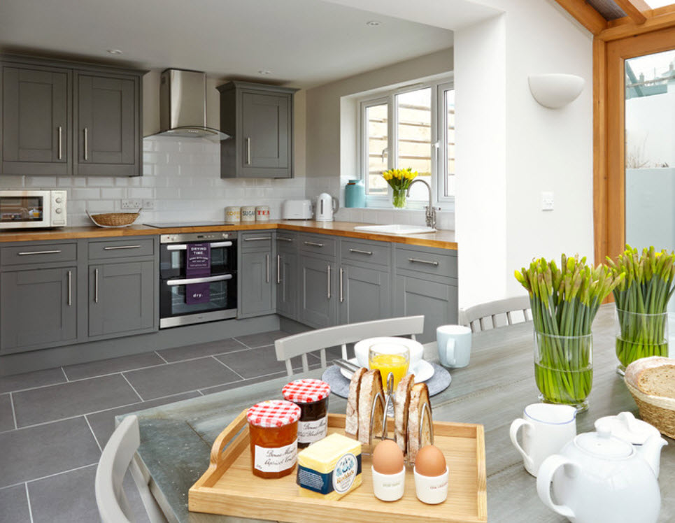
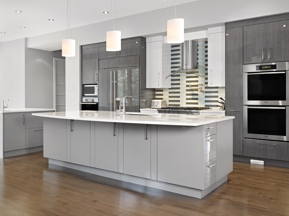
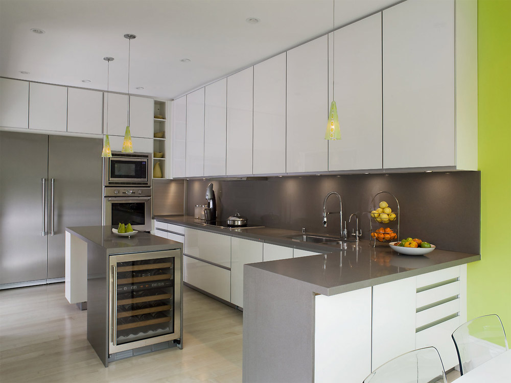
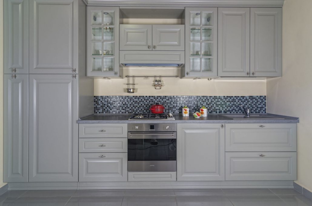
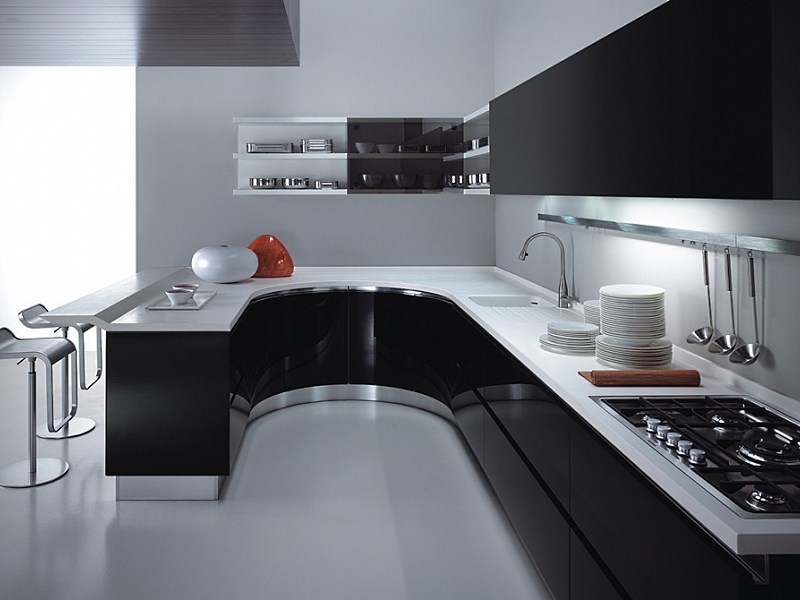
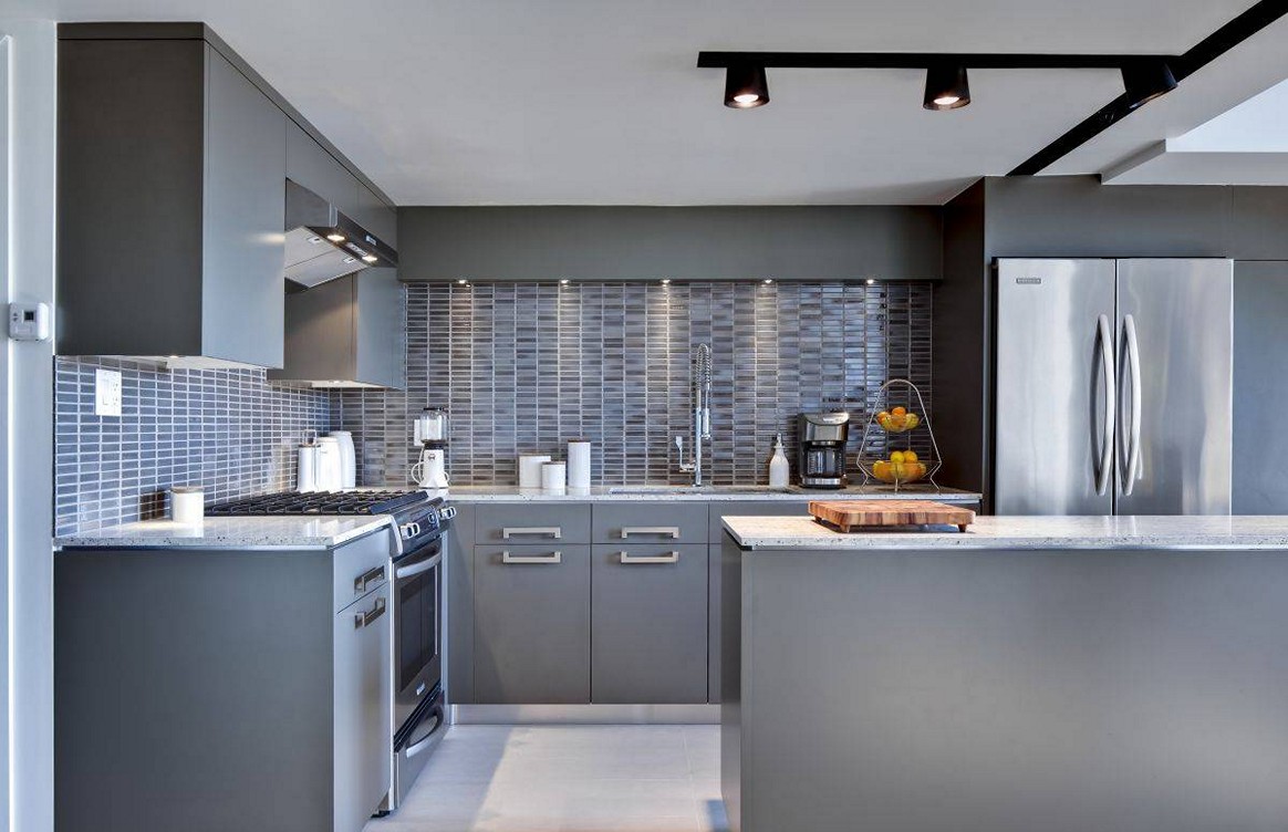
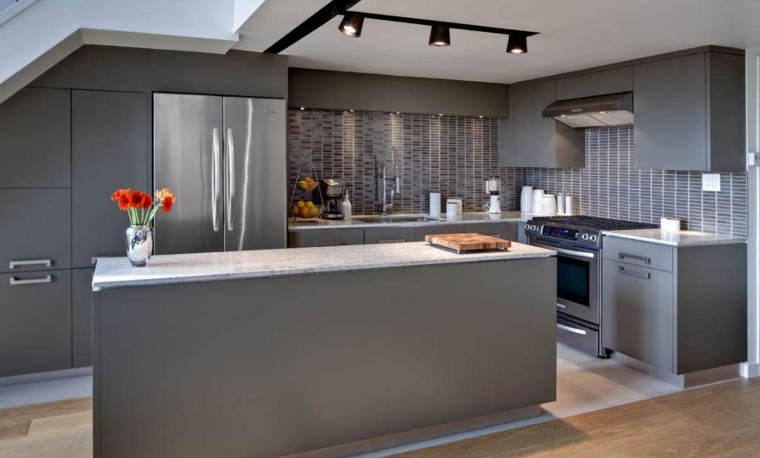
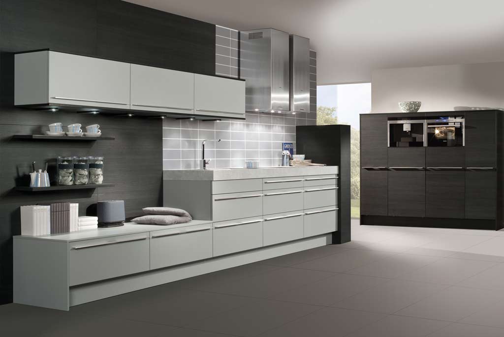
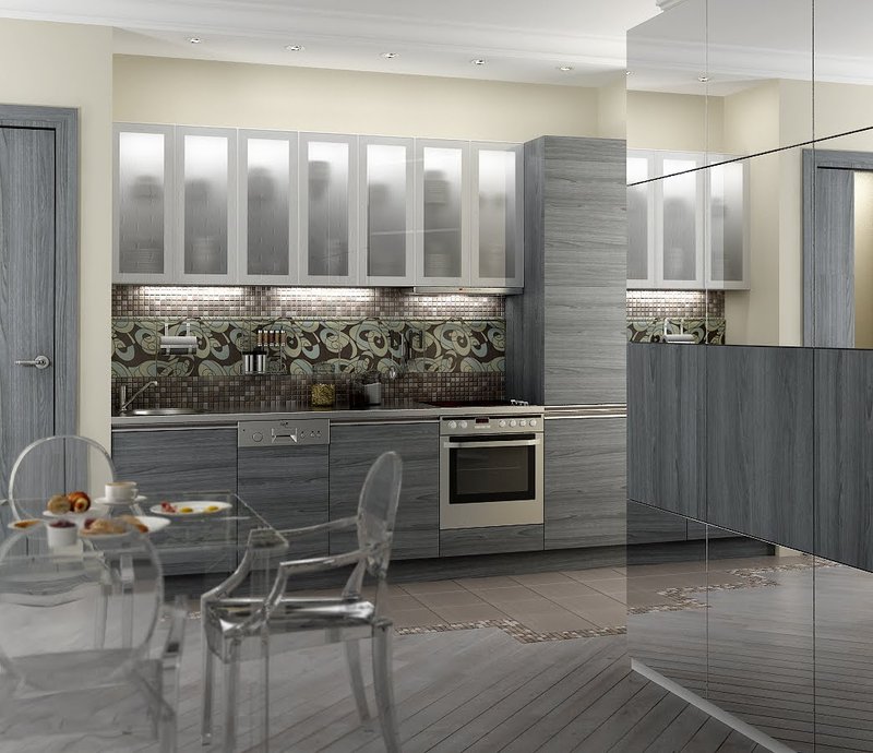
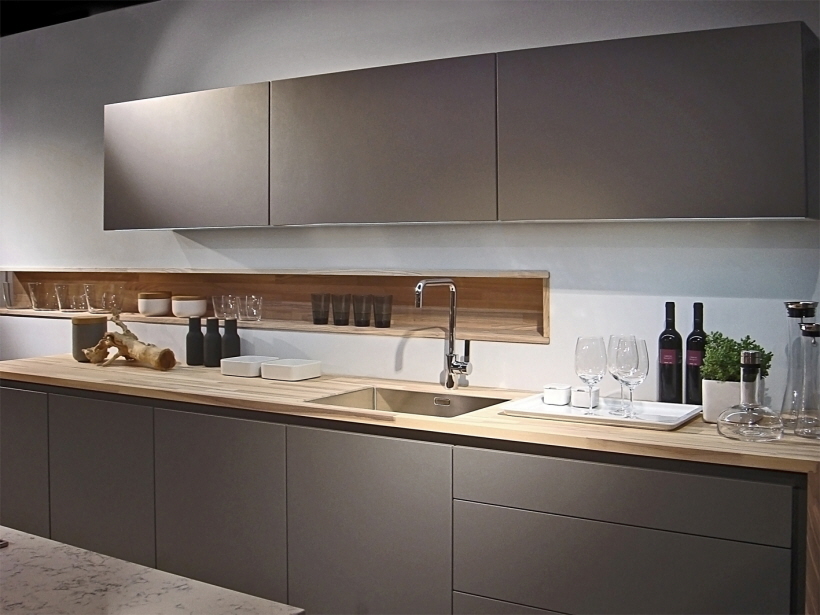
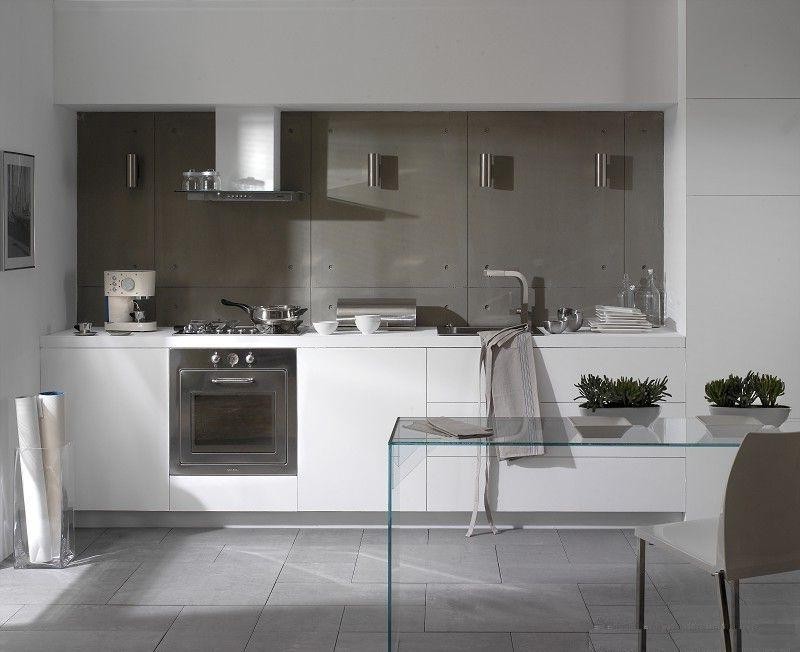
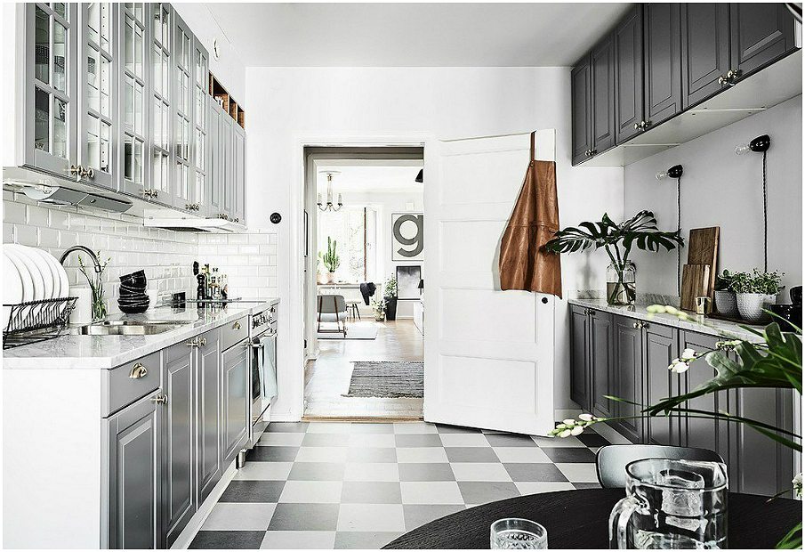
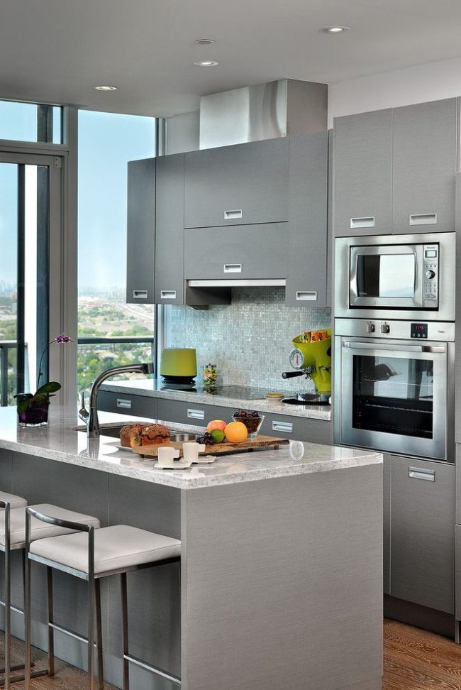
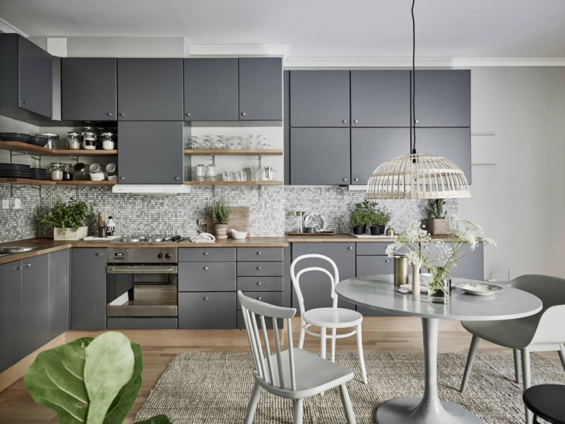
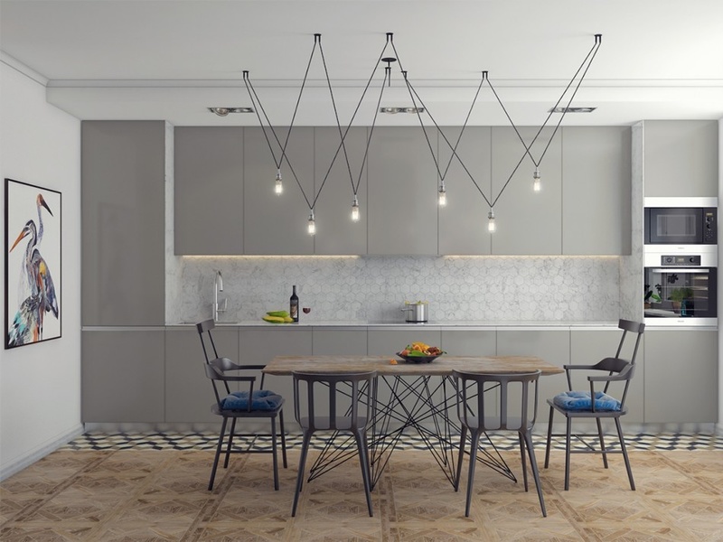
Gray kitchen design
For a more detailed study, we consider separately the design of facade surfaces. Based on these recommendations, you can correctly formulate a project plan for the future kitchen.
Ceiling
The ceiling surface is best decorated in light colors - light beige, blue, these colors effectively harmonize with the gray walls. Designers are often advised to choose a white ceiling, regardless of the main shade in the interior.
The white ceiling stands out against the background of gray walls.
Additionally, install silver or chrome lamps, they are designed in the chosen style and will look very elegant indoors. As an alternative, dilute the main lighting with a spotlight, this will add beauty and originality (you can mount the LED strip not only on the ceiling, but also on the kitchen).
Spot lights make the ceiling more interesting
Chandeliers and luminaires coated with chrome or silver metallic seamlessly blend into the design
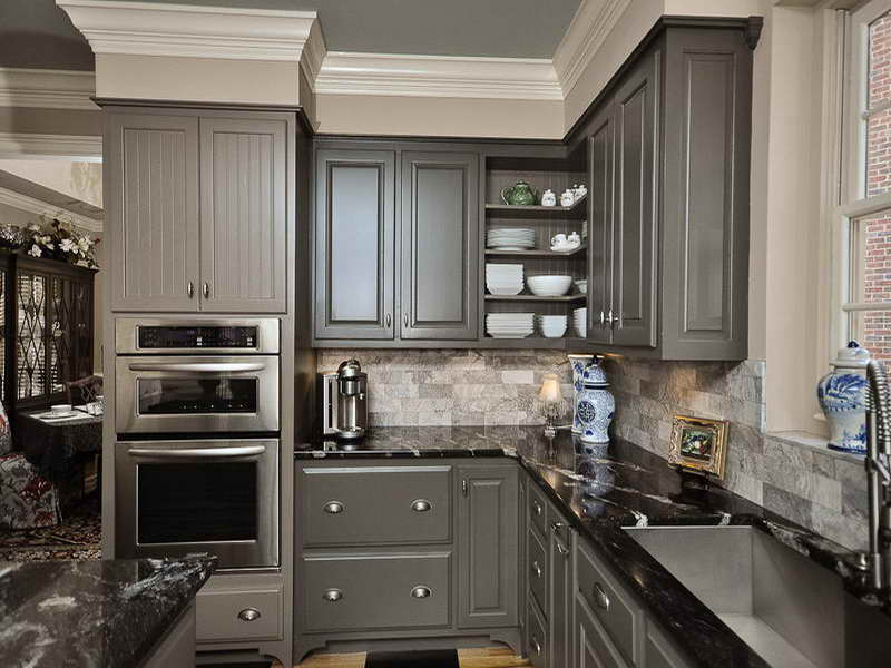
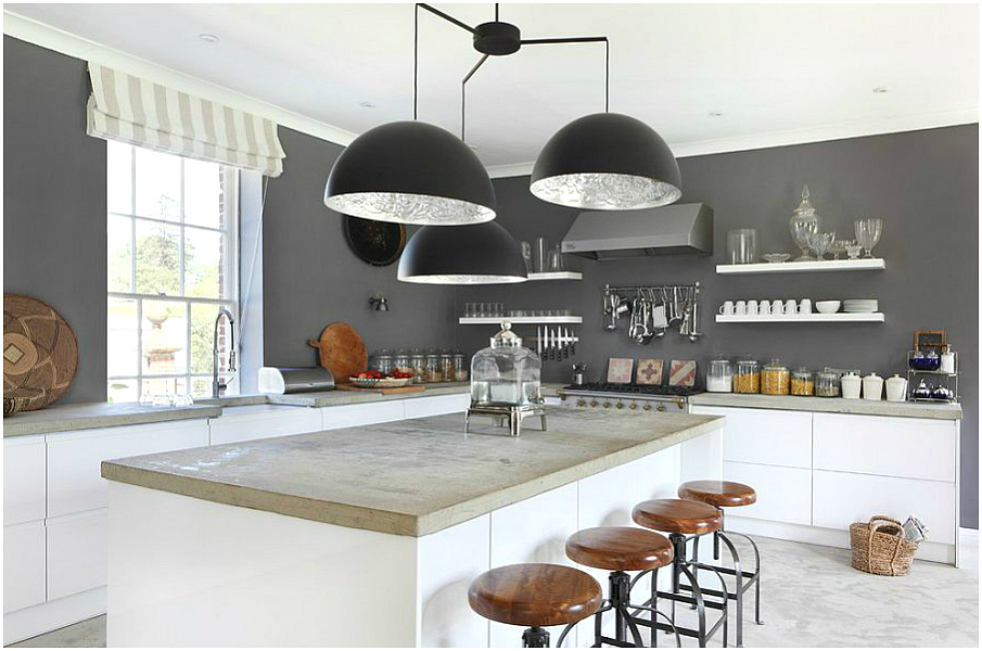
Walls
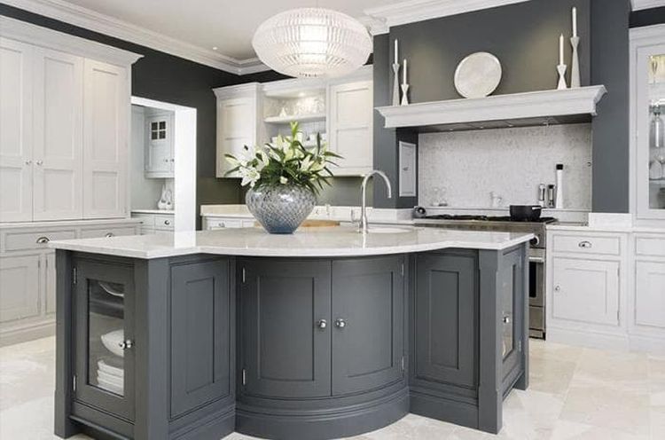
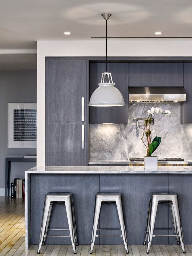
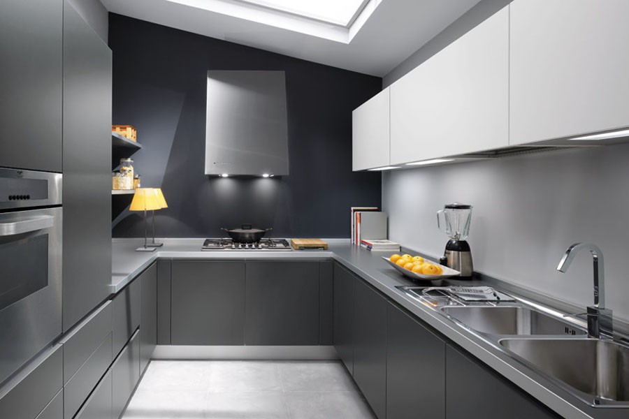
When processing walls, it is better to give preference to light shades, for example, pearl, graphite, light gray, silver. The use of dark tones can lead to excessive gloom and coldness of the room.
Competent lighting will add a pearl shade to the kitchen
The graphite hue balances between silver and dark.
If you want to delimit the space into certain zones - take a few tints. Different colors, this is a great way out of the situation!
Gray out different areas in the kitchen
Want to paint the walls? Then you will certainly like the ideas of designers, for effective wall painting there are many beautiful compositions and techniques:
smooth transition of shades with blurred borders;
geometry - horizontal zigzags (starting from the ceiling, from light to dark);
screen painting, etc.
Floor
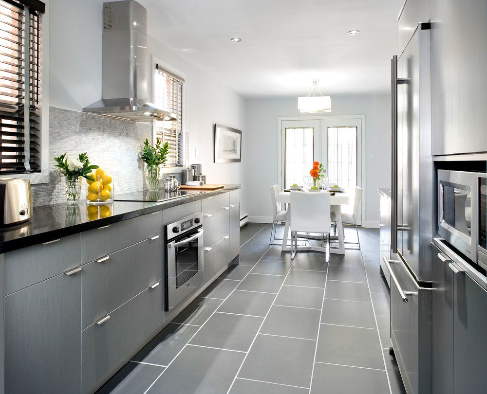
Thinking over the design of the flooring, do not dwell on warm colors. If it, like the rest of the facades, is designed in gray, select a tone identical to the color scheme of the walls, or a little darker.
Floor in darker colors
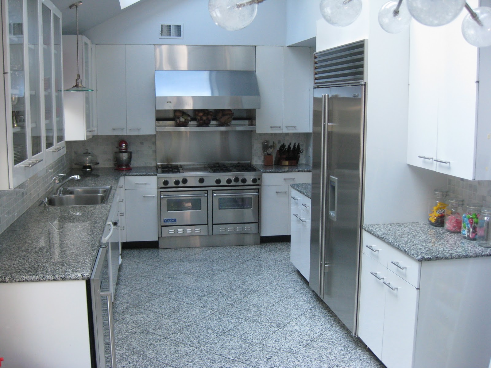
The interior of the kitchen in gray tones looks simple when the floor is tiled with marble or natural stone, or with a dark brown and brick laminate.
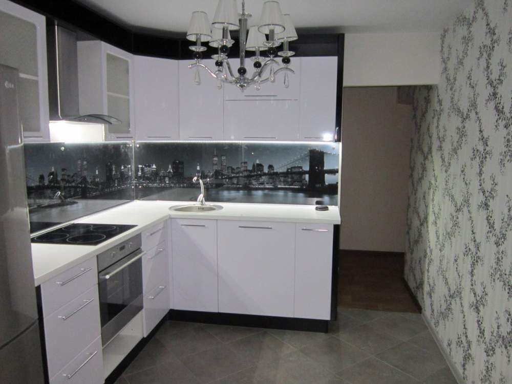
Kitchen and apron trim
The kitchen is the central part of the room and occupies a large area. Therefore, so that all the components of the interior of the kitchen harmoniously harmonize with each other, pay special attention to this furniture.
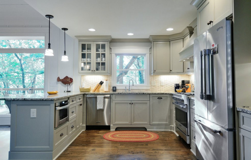
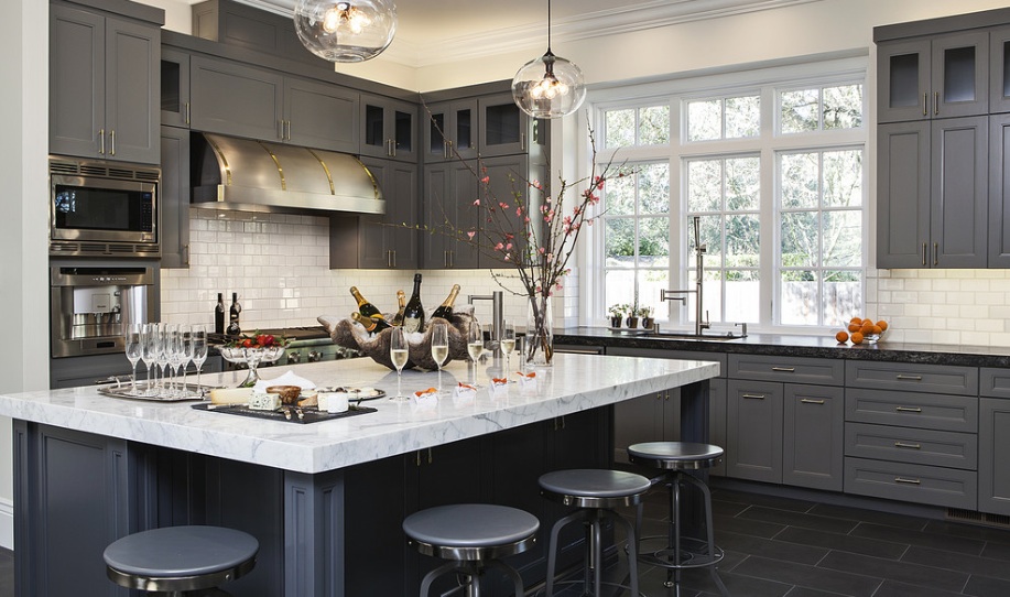
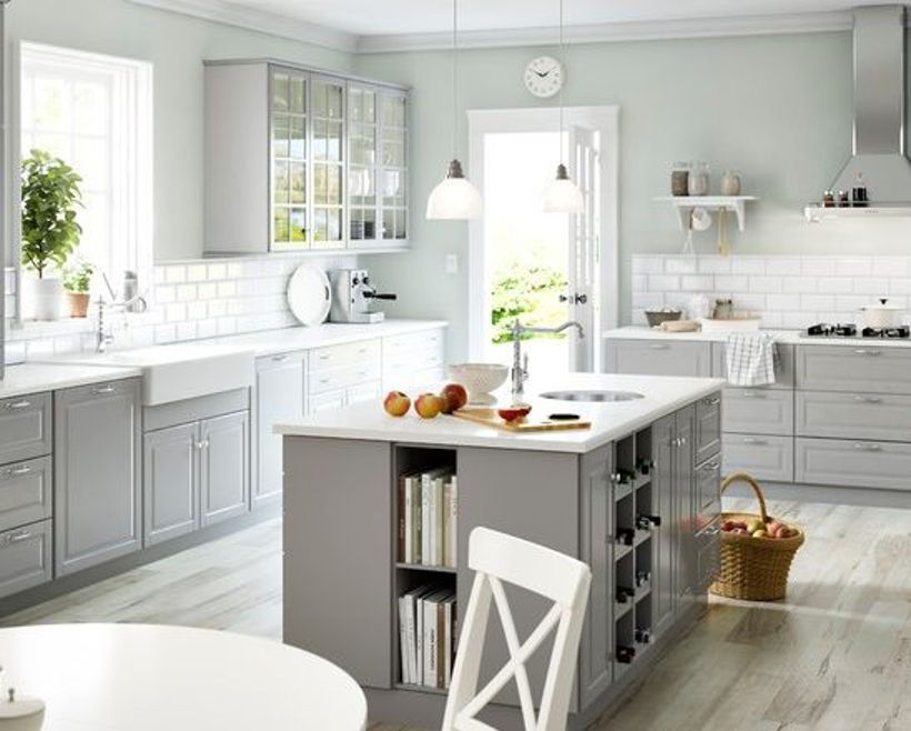
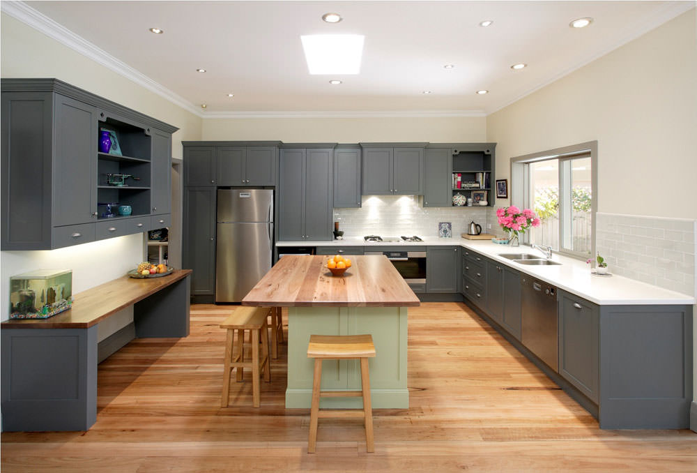
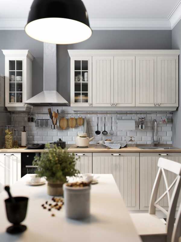
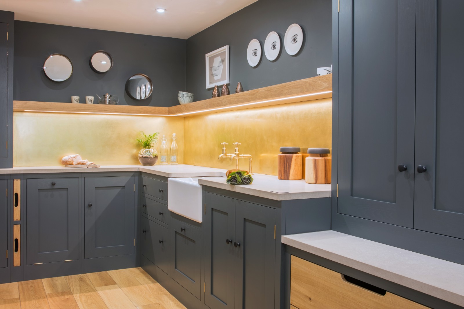
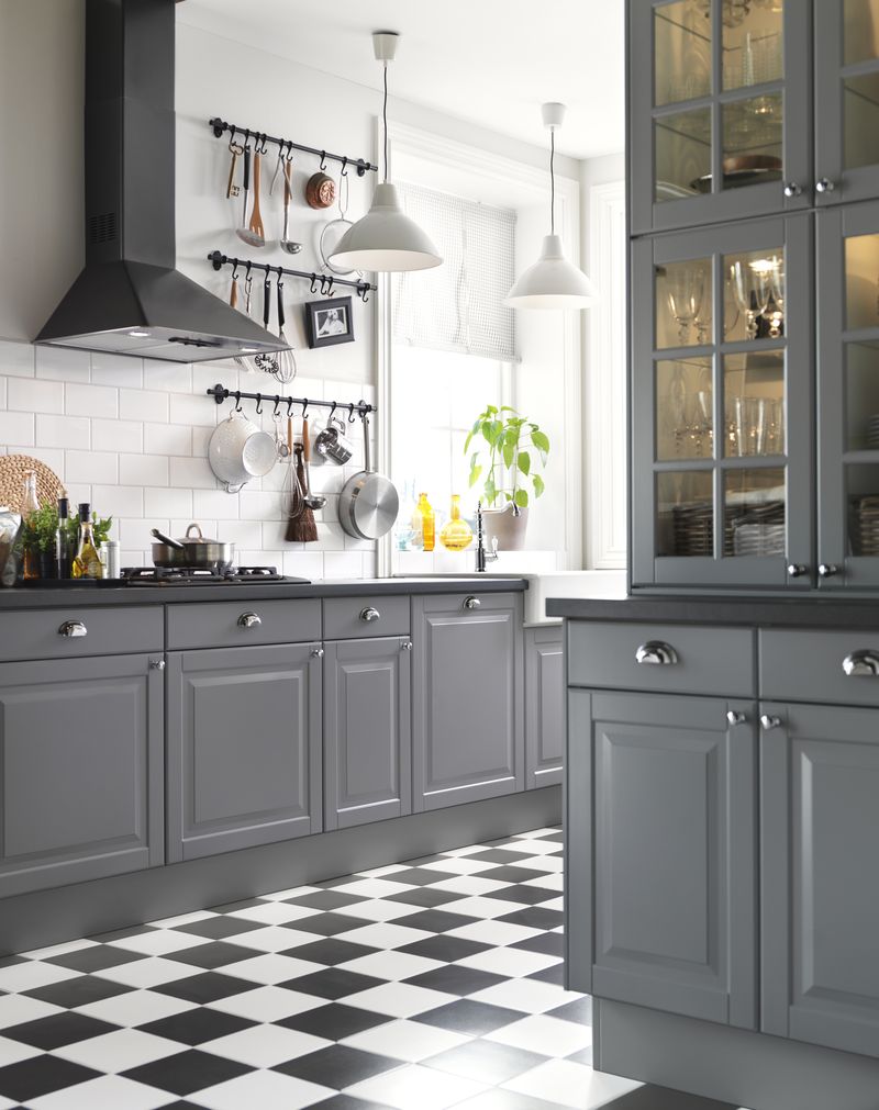
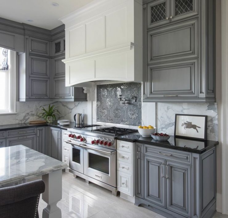
The classic version of the combination of white (top) and gray (bottom) color for the design of facades. No less profitable is the gray tone combined with blue, green and purple - this choice depends only on your individual preferences.
Floor in darker colors
Classic blue apron kitchen apron
Tip: "Using the technique of" smooth transition from light to dark "it is possible to visually increase the height of the ceilings."
Transition to gray walls through similar floor and ceiling colors
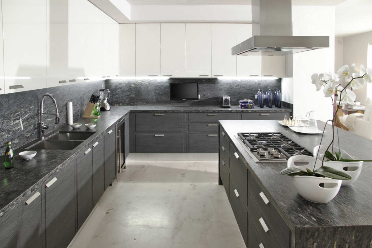
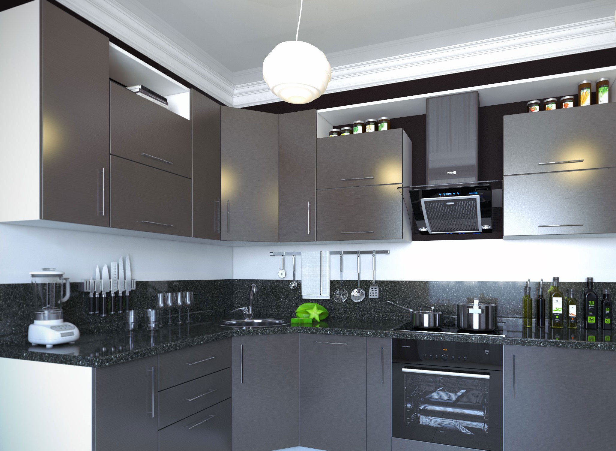
You can choose any material for the furniture set, as well as decorative effects (wooden, carved, glossy facades, etc.). Focus on the accessories - chrome or silver-plated handles perfectly fit into the overall style.
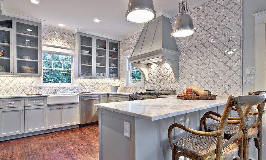
An apron is best made from tiles or mosaics. The tone is selected based on the color scheme of the furniture itself. The gray set is beautifully set off by a “metal” apron, or by art deco and modernist compositions.
Make a mosaic apron from a lighter and darker shade
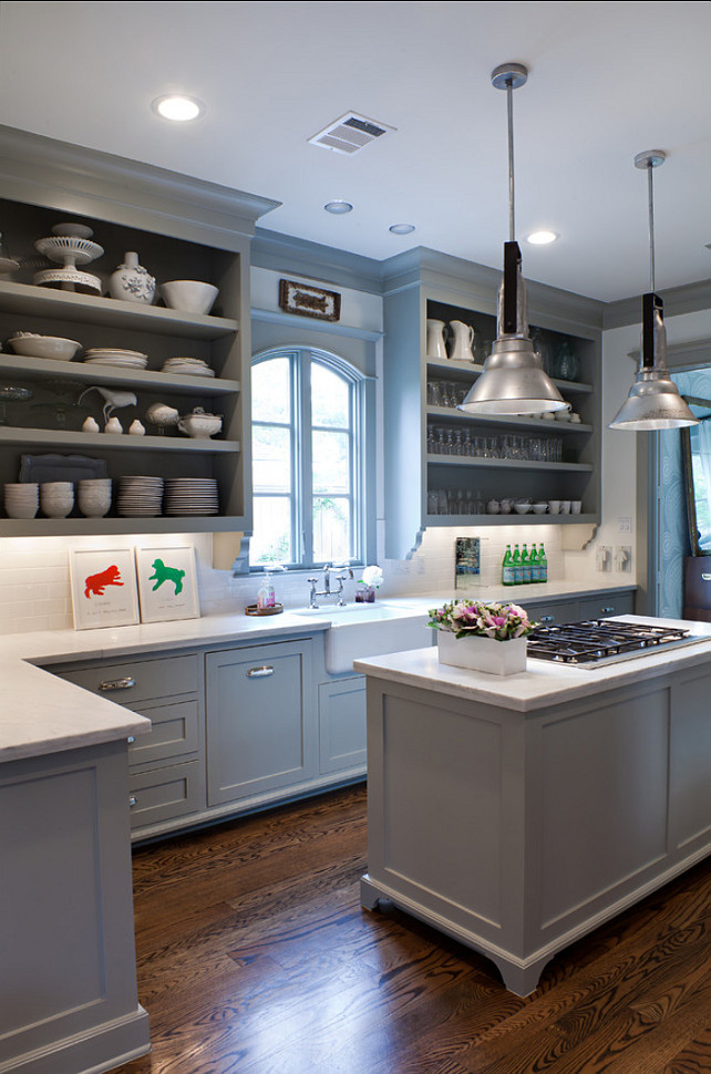
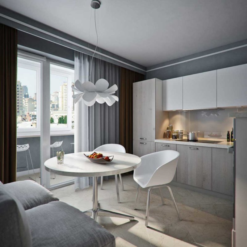
Dinette
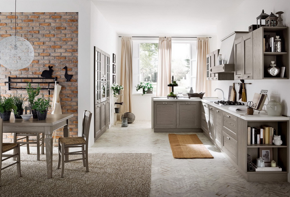
The kitchen table and chairs in the gray kitchen must be selected based on the design style. If the classic version is taken as the basis - dining furniture made of wood will complement the interior.
The dining area should be designed in accordance with the general palette
The marble top of the dining table looks very practical and stylish.
The hi-tech style looks spectacular with a glass table with chrome legs and leather-covered chairs. Consider also furniture with glossy surfaces, in combination with the glitter of the kitchen set you get an original set.
Curtains and cooking utensils
Decorative and household items can play the role of the “cherry on the cake”, which will give the interior of the gray kitchen completeness and aesthetic beauty.
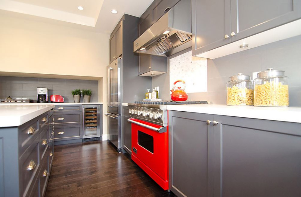
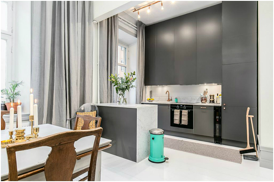
Red interior elements will be visible in gray.
Even the smallest details must be considered! Buy fruit / flower vases, dishes, decorative napkins on the table, paintings, etc. in the same color scheme, do not make too bright accents.
If you decide to hang curtains, do not choose heavy materials. Curtains, blinds made of light tulle or transparent beads - this is exactly what suits you.
Gray curtains should not burden the look of the kitchen
Choose a wallpaper
For the execution of the kitchen in gray tones, the light gamut of this color is suitable. Gray color is universal, so you can not worry about how to successfully arrange all the elements in the future.
Gray wallpapers will create a suitable background for a furniture set
A few recommendations:
if you purchased a gray wallpaper, then use the furniture details in white;
there are many combined wallpapers in the stores - choose a ready-made variation;
Do not be afraid to buy gray wallpaper with drawings, floral prints or geometric shapes will refresh the interior.
The combination of gray with other colors
In order to properly dilute the interior in addition to the gray shade, use one of the proposed options:
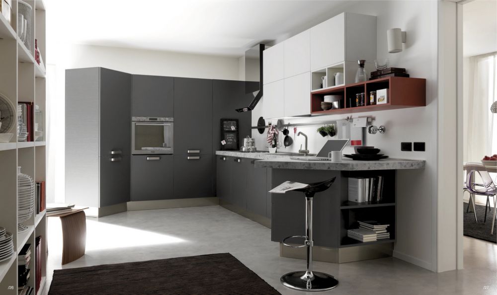
White - gray-white composition - the most organic duet. The gray walls in the ensemble with the white facades of the headset, the metallic gloss of the countertops and household items create a practical setting. But in this combination it is simply necessary to make juicy and bright colors, otherwise it will soon get bored with time.
The gray palette must be diluted with white and small islands of other brighter colors
Beige - a chess alliance of two color palettes will give the inhabitants warmth and tranquility.
A harmonious warm combination of two neutral palettes
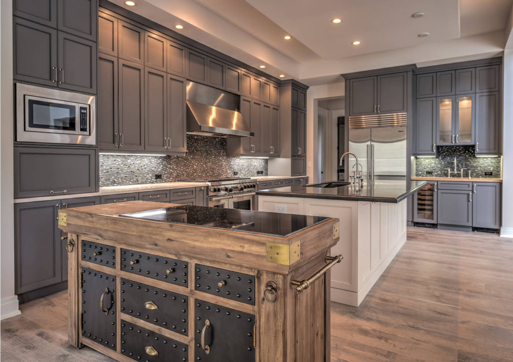
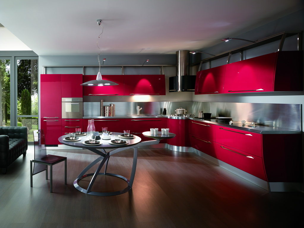
Red - burgundy or scarlet color will give bright and cheerful emotions, and a cool gray tone will bring a touch of serenity and strict restraint. A red sideboard and a silver table are the perfect match.
Set of red color cuts the interior into two parts
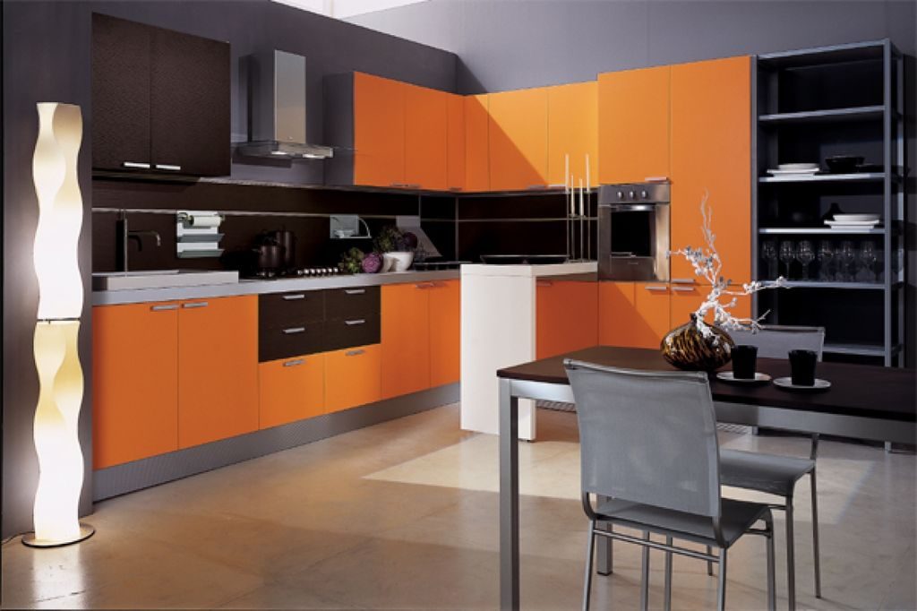
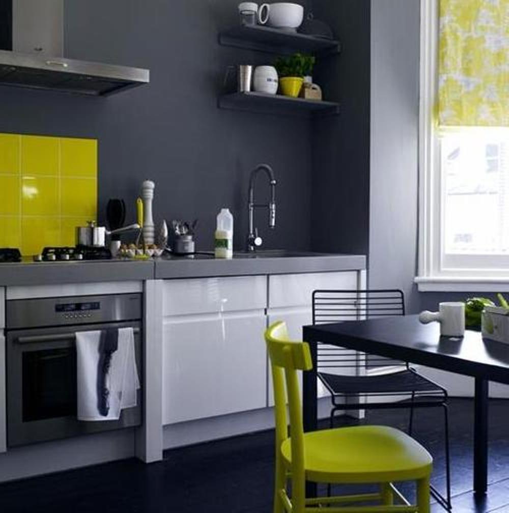
Orange - orange blotches on a gray background will delight households, while the combination will not be annoying, since both tones are advantageously combined.
Orange will speed your morning dullness
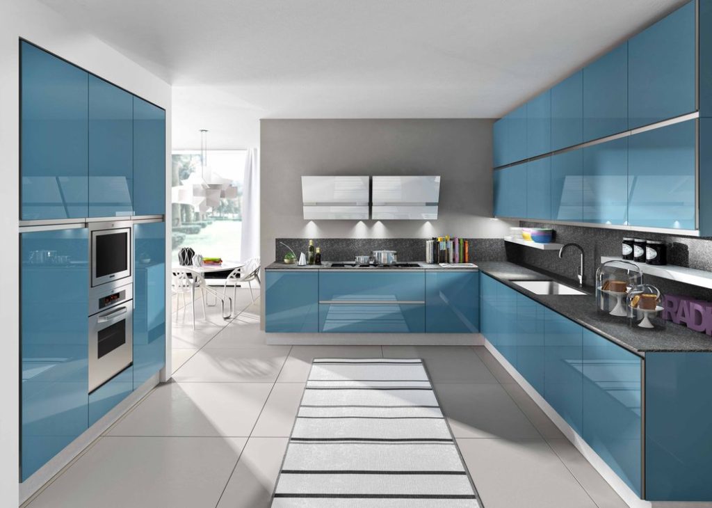
Blue - a classic variation of the design of the kitchen. Respectability and moderate severity, this is how this duet can be characterized.
Moderate colors of gray and blue tones blend well
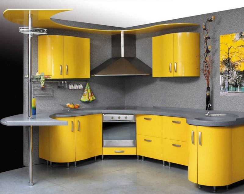
Yellow - for lovers of vivid impressions, a pair of Marengo-lemon is suitable. Well, for those who appreciate dimensionality and homeliness, it is better to refrain from cardinal decisions, stop your choice on pale shades.
Vibrant yellow will appeal to energetic people
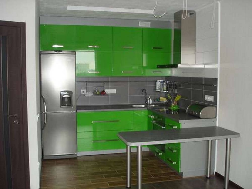
Green - gray-green union - the choice of cheerful and optimistic people! Every day in such a kitchen begins exclusively with bright moments filled with positive energy.
The green color in the gray palette looks like spring grass of a lawn among asphalt
Video of new design solutions for the kitchen in a gray palette:
Another 50 photos of the kitchen with a gray palette for your ideas:
Any kitchen requires a dining table. What it will be depends on the design of the dining room itself. Give comfort, make a place where all will gather ...
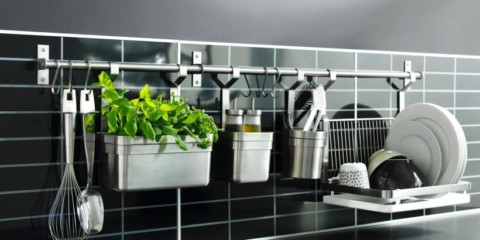
For those who want to have a practical, convenient, stylish and ergonomic kitchen area, be sure to pay attention to the railing systems that are popular today ....
At first glance, the task of creating a beautiful kitchen design of 9 sq.m. seems unsolvable. But this is quite real, if you look in detail at this issue ...
In the kitchen you often have to cook. Because of this, walls, floors, and even ceilings can become dirty. And if the floor is not so dirty to dirty, and the ceiling is almost unrealistic ...
What does a kitchen repair look like 6 sq. m. in the "Khrushchev"? Most often quite original - an abundance of new-fangled stylistics, modern high-quality materials ...


 Kitchen
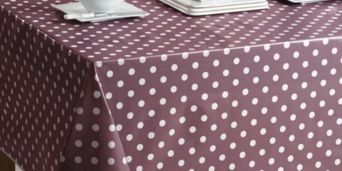
The choice of tablecloths on the table under the design of the kitchen
Kitchen
The choice of tablecloths on the table under the design of the kitchen